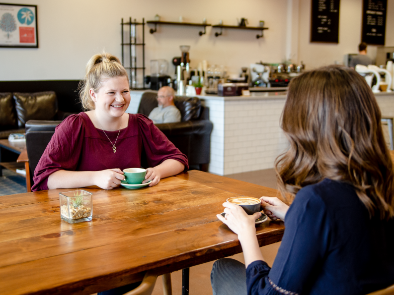
Our Brand Suitcase

Last Updated June 24, 2019

Centra Icon

Voice and Tone

These personality traits and behaviors strengthen our reputation. Sometimes it is not what you say, but how you say it.

Voice

We are assured in ourselves and our capabilities but humble in our words and actions.

We strive to always remain professional and approachable.

We seek to present ourselves as polished, but we also value being straightforward and simple.

We want to be inclusive and helpful in our language and content.

Tone

General Tone

  • Caring but not over-the-top.
  • Accessible but not casual.
  • Established but not elitist.
  • Expert but not condescending.
  • Considerate but not avoidant.
  • Compelling but not sensational.
Professional
Playful
Corporate
Casual
Calm
Energetic
Literal
Imaginative

Terminology

Healthcare is written as one word.

Times are written without periods. For example, 11 am.

Noon and midnight are written out.

Use an en-dash without spaces to indicate a range of time: noon-3 pm.

Always spell out months. For example, January 31 or September 12, 2019.

Regions are not capitalized. For example, central and southside Virginia

Format phone numbers with periods, not parentheses or dashes/hyphens. For example, 434.200.3000.

Spell out street addresses completely. We do not abbreviate things like St., Ave., etc. For example, 3300 Rivermont Avenue.

Remember, we always use an oxford comma.

Logo & Icon

Logos are key brand identifiers — that is why it is imperative ours is always used consistently.

Clear Space and Minimum Sizes

Our logo and icon should always be placed consistently so that it is easy to find. Start by ensuring appropriate space around the logo—it should never be lost amongst other logos or graphics. Following these minimum clear space guidelines will ensure clarity and legibility.

The logo should be placed at least a radius of the icon away from other elements.

The icon should also be placed at least a radius of the icon away from other elements.

For small spaces, do not to use the logo or icon at dimensions smaller than the specified minimum sizes.

Logo Clear Space 


Icon Clear Space

Minimum Sizes

Placement

Place our logo in one of the four corners of an application.

Always align the logo against the margin.

Corner placement

Corner placement 2

Logo Don'ts

Don't change the colors.

Don't tilt or rotate.

Don't skew or stretch.

Don't use different fonts or re-typset.

Don't place on colors with insufficient contrast.

Don't rearrange.

Sub-brand Logos

In addition to the Centra logo, there are sub-brand logos. All of the rules that apply to the Centra logo also apply to the sub-brand logos, including placement, color, and sizing.

Sub-brand Logo Vertical Breakdown

Sub-brand Logo Horizontal Breakdown

Color

When creating or printing a piece, be sure to double check the colors you are using. Remember, different mediums require different color values, color proportions matter, and some colors are used for specific types of content only.

Basics

Our color palette consists of calming natural greens that are punctuated by vibrant and energetic contrasting hues. Use the specified values to ensure color consistency across all branded materials. Some colors are meant to be used more sparingly than others. The chart below shows the color relationships in a given brand application. These percentages are not compulsory, they are only provided to give a general idea of recommended proportions.

Swatches

When color consistency is imperative, use Pantone values. Coated (C) values are for glossy paper and uncoated (U) values for matte paper.

For general printing, use CMYK. This is often more economical than Pantone.

In digital contexts, like websites and projections, use RGB & Hex values.

Green

Pantone

383C

CMYK

29 01 100 18

RGB

168 173 00

Hex

#a8ad00

Show Tint Values
  • PantoneTint90% Tint

    CMYK26 01 90 16

    RGB176 182 75

    Hex#b0b64b

  • PantoneTint80% Tint

    CMYK23 01 80 14

    RGB185 190 95

    Hex#b9be5f

  • PantoneTint70% Tint

    CMYK20 01 70 13

    RGB194 198 115

    Hex#c2c673

Light Gray

Pantone

418C @ 2%

CMYK

01 01 01 01

RGB

248 237 246

Hex

#f8f7f6

White

Pantone

CMYK

01 01 01 01

RGB

255 255 255

Hex

#ffffff

Teal

Pantone

3155C

CMYK

100 09 29 47

RGB

00 98 114

Hex

#006272

Show Tint Values
  • PantoneTint90% Tint

    CMYK90 08 26 42

    RGB27 114 128

    Hex#1b7280

  • PantoneTint80% Tint

    CMYK80 07 23 38

    RGB52 130 142

    Hex#34828e

  • PantoneTint70% Tint

    CMYK70 06 20 33

    RGB77 145 156

    Hex#4d919c

Blue

Pantone

7703C

CMYK

79 02 10 11

RGB

00 156 189

Hex

#009cbd

Show Tint Values
  • PantoneTint90% Tint

    CMYK71 02 09 10

    RGB27 176 202

    Hex#1ba6c4

  • PantoneTint80% Tint

    CMYK63 02 08 09

    RGB52 176 202

    Hex#34b0ca

  • PantoneTint70% Tint

    CMYK55 01 07 08

    RGB78 186 209

    Hex#4ebad1

Purple

Pantone

2726C

CMYK

81 70 00 00

RGB

72 92 199

Hex

#485cc7

Show Tint Values
  • PantoneTint90% Tint

    CMYK73 63 00 00

    RGB97 111 180

    Hex#616fb4

  • PantoneTint80% Tint

    CMYK65 56 00 00

    RGB132 143 196

    Hex#848fc4

  • PantoneTint70% Tint

    CMYK57 49 00 00

    RGB150 159 205

    Hex#969fcd

Charcoal

Pantone

418C

CMYK

38 26 40 72

RGB

81 81 81

Hex

#515151

Typography

Chapter Regular and Source Serif Pro are the typefaces that should be used on all materials from internal communications to external marketing. The fonts we use and the way we place our content helps our patients and employee easily understand our messages and find what they are looking for. This is why it’s important to adhere to our typography rules.

Basics

Headline Typeface

Chapter Regular—AaBbCcDdEeFfGgHhIiJjKkLlMmNnOoPpQqRrSsTtUuVvWwXxYyZz
0123456789.,;:(?&@$#)\

Body Typeface

Source Serif Pro—AaBbCcDdEeFfGgHhIiJjKkLlMmNnOoPpQqRrSsTtUuVvWwXxYyZz
0123456789.,;:(?&@$#)\

Type Hierarchy

The size of our font will vary across applications, but here are some general rules.

Headlines are best set at 24pt or larger. They should be noticeably bigger than body text. Headlines will be the largest text in a composition. They should be short and important. All headlines should be formatted in sentence case (capitalizing only the first word and ending with punctuation).

Body text is best set between 7pt and 19pt, with care given to legibility. There should be a generous amount of spacing between each of the lines (also known as leading).

Lists are set at the same size as body text. Bullets are indicated with a single en-dash. Bullets that are longer than a single line should share the same left indent value.

A link or call to action should be italic, set in teal, and made the same size as the body text.

Captions and fine print are the smallest texts in a composition. They are used sparingly to annotate imagery or detail legal print at the end of an application. They should be noticeably smaller than the body text.

Sample Settings

Our Websafe Typefaces

There are some limitations when it comes to applying your brand typefaces on digital platforms. When working with HTML applications like email, here are some contingencies.

Whenever you are unable to use Chapter for headlines, use Palatino.

Times New Roman can be used in place of Source Serif for body text and captions.

Websafe Headline Typeface

Palatino—AaBbCcDdEeFfGgHhIiJjKkLlMmNnOoPpQqRrSsTtUuVvWwXxYyZz
0123456789.,;:(?&@$#)\

Websafe Body Typeface

Times New Roman—AaBbCcDdEeFfGgHhIiJjKkLlMmNnOoPpQqRrSsTtUuVvWwXxYyZz
0123456789.,;:(?&@$#)\

Download font files

Graphic Elements

These are unique design elements that add flavor and personality to our brand, making us recognizable and memorable. Pay close attention to each asset as they often have different rules for placement.

The Wave Container

The wave container  is one of our defining graphic elements. Here are some things to keep in mind.

For general applications, use tints of green to build this container.

For internal communications, like the Discover Our Why campaign, use tints of purple to build this container.


Wave container anatomy

Color tint breakdown

Use a variety of crops

Purple wave containers are used for internal applications.

Download File

Secondary Wave Container

The secondary wave container is a supporting element. It comes in a variety of configurations and colors.

Never place it close to a primary wave container. 

Use it sparingly. Examples of proper content uses include testimonials, inspirational messages, and philosophical statements.

When designing this container, do not use tints. All colors are 100% values.

Type within the container is white.


Secondary wave container anatomy

Use a variety of crops and colors

Do not use tints

Download File

Applications

Here’s our visual style in action. In these applications you will be able to see how all of our assets work together to create a cohesive and well-positioned brand. When creating new applications, compare them with these examples to ensure they fit in seamlessly.

Physical Applications

Print Ad

Internal Communications: "Discover Our Why" Elevator

Digital Applications

Home Page

Internal Communications: "Discover Our Why" Landing Page

Photography

Our photography is relatable, showcasing the patients and communities we serve. Remember, when selecting an image and headline, it is more impactful if they work together.

Basics

Select images that reinforce our core messaging, voice, and tone. Real locations and situations are preferred where subjects are in their natural setting and not looking directly at the camera. Keep the audience in mind when selecting images.

Below you will see examples of photography. Ask yourself, does this feel relatable? Does it feel like it could have been shot in Central Virginia? Is it timely? Is it natural?

Consider images with a similar depth of field, coloring, and feel as the examples below. Do not use studio-style images with subjects looking directly at the camera. Stay away from anything that looks posed or staged.

Examples of patient-focused photography

Photography Do's and Don'ts

Select photos that make natural use of color and light

Avoid photos with austere, monotone color palettes

Focus on human interactions

Avoid photos without people

Select in-the-moment photos that elicit genuine emotional responses

Avoid photos where body language and facial expressions feel posed

Select scenes that feel natural and real

Avoid overly staged scenes

Asset Downloads

Whether it is your first time reviewing this Brand Suitcase or the 132nd, it is always smart to revisit the rules and recommendations for the specific files you are downloading. Keep in mind, this platform will continually be updated as our brand grows — so be sure to check back with each new project.

Sub-brand Logo