Outlined here are the foundational messages that keep your company rooted and standing tall. Reference this section when making decisions about partnering with new organizations, participating in events, or creating new ad campaigns to ensure they are in line with your vision.
Brand Essence
Proxios partners with businesses to provide custom IT solutions that make them more productive and profitable. We aim to discover the shortcomings of our clients’ organizations, diagnose the root of their problems, and design custom delivery strategies. These efforts will maximize the competitive advantage for each client.
Brand Promise
Partners of Proxios can expect individualized solutions and seamless communication throughout the process. They will be impressed with our dedication to understanding their business needs and our commitment to provide top-notch security. With all of these efforts combined, clients will have peace of mind and a newfound competitive edge that will allow them to transform into a highly productive and profitable organization.
Position
IT Runs in the Family
Every client of Proxios is like family to us. Early on, we treat our clients as longtime friends and value easygoing conversation over corporate small talk. We spend ample time with each client, from start to finish. Through present and focused discussion, we are able to tap into our clients’ complex technological challenges before diving head first into an IT solution. Our complimentary discovery, diagnosis, and design stages show our commitment to understanding our clients’ unique business obstacles.
In fostering these connections, we strive to put ourselves in their shoes, and operate with empathy to create groundbreaking IT solutions. Through communicating in a conversational and attentive manner, our clients can fully rely on our IT service delivery and shift their focus to transformation, instead of running in place. Proxios is always easy to reach and eager to answer any questions, emphasizing that we treat our client’s problems like our own.
With every client of Proxios, we aim to build a relationship based on trust and security. Our pure intention is to transform their business into a highly productive and innovative organization, through reliable technology and personable service. Every client will feel like a part of our Proxios family.
Elevator Speech
We offer fully-managed IT solutions to growing companies. Our goal is to decrease your IT spending in the long run through the use of virtual servers. In the end, your organization will operate with efficient technology that will enable you to surpass your competitors.
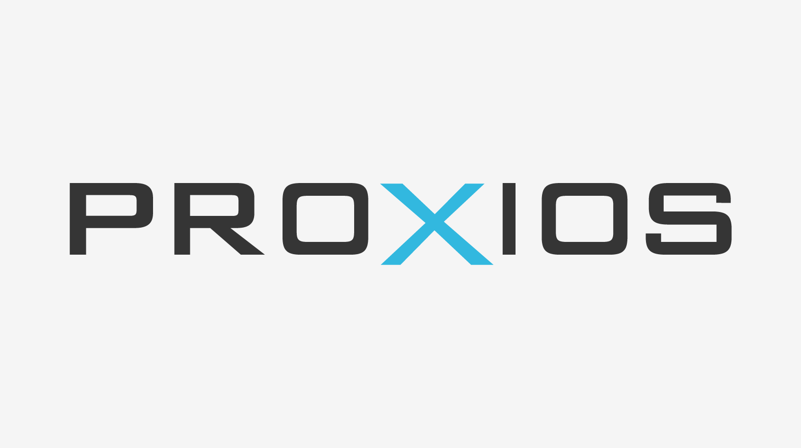
Logo & Icon
Logos are key brand identifiers — that is why it is imperative ours is always used consistently.
Basics
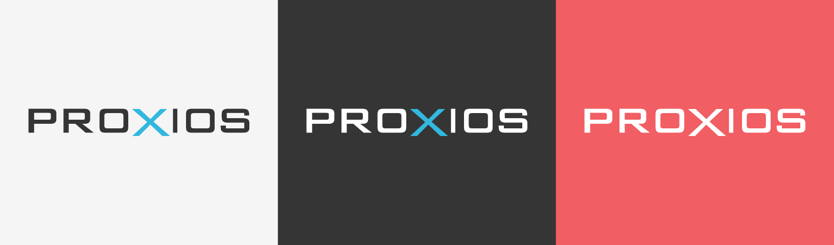
On dark backgrounds, use the logo with light text.
On light backgrounds, use the logo with dark text.
When placing the logo on an expanse of one of the brand colors, use the all white version.
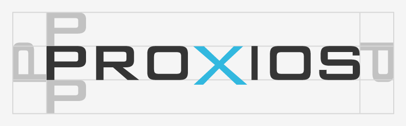
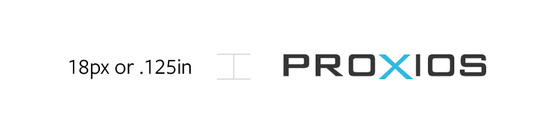
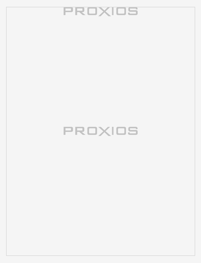
The logo should be placed at least an P’s worth of space from other elements. For small spaces, be sure not to use the logo at dimensions smaller than the specified minimum sizes.
Logo Clear Space
Minimum Sizes
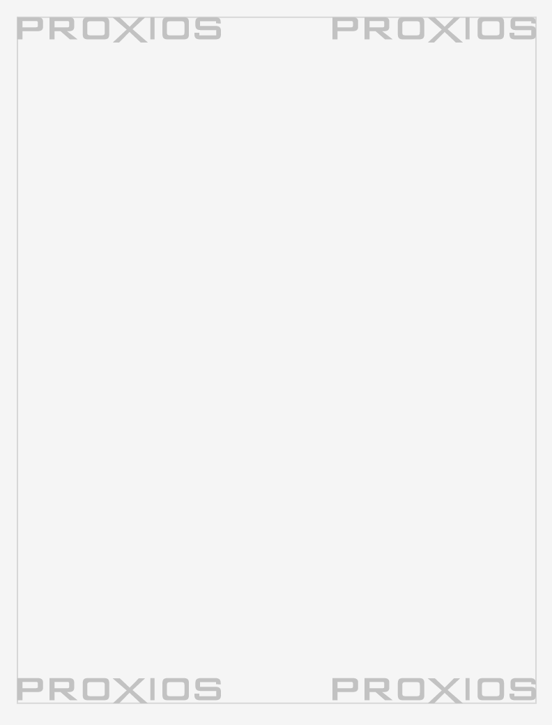
Placement
Place our logo in the corner of an application, or center it. Align the logo against the application’s outer margins.
Corner placement
Central placement
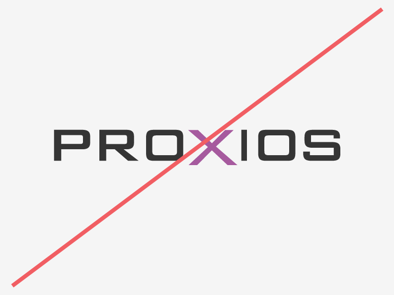
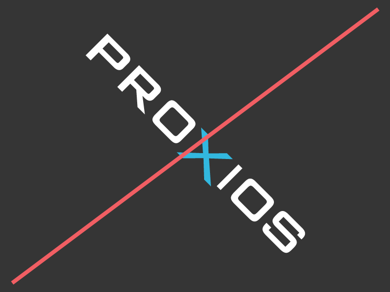
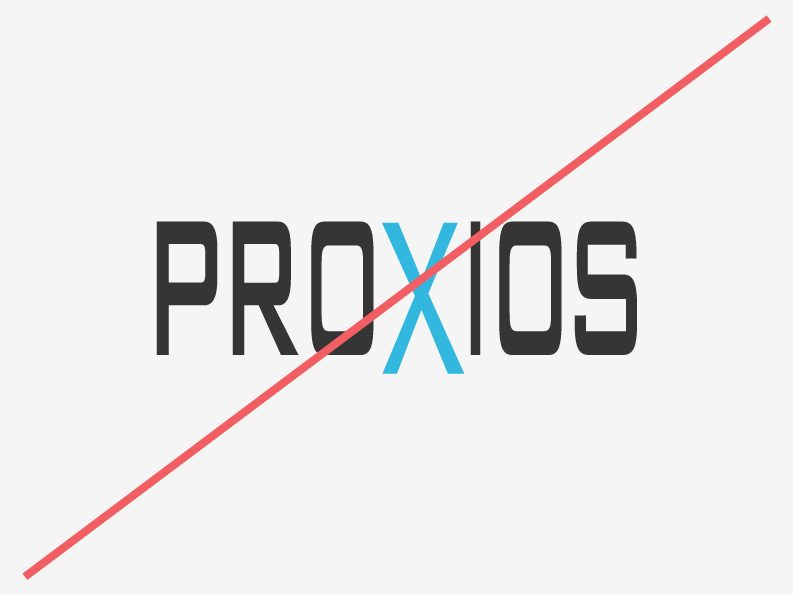
Logo Don'ts
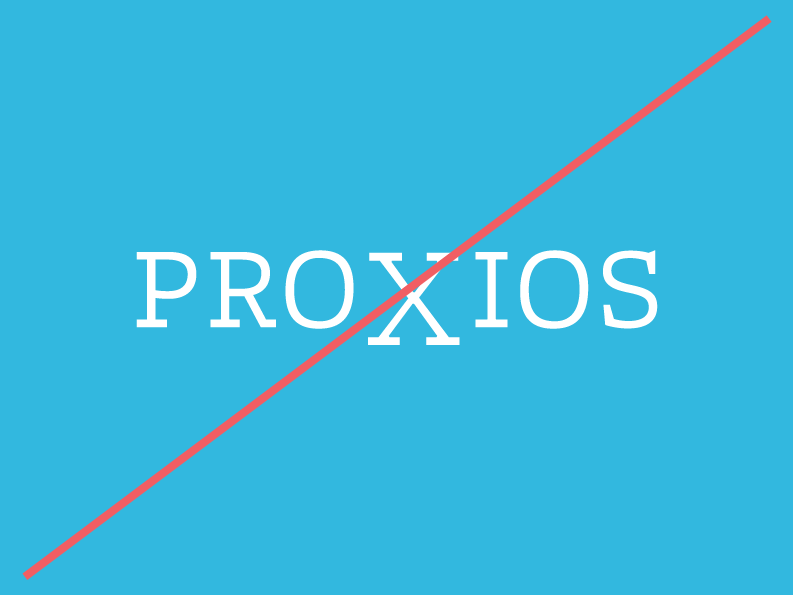
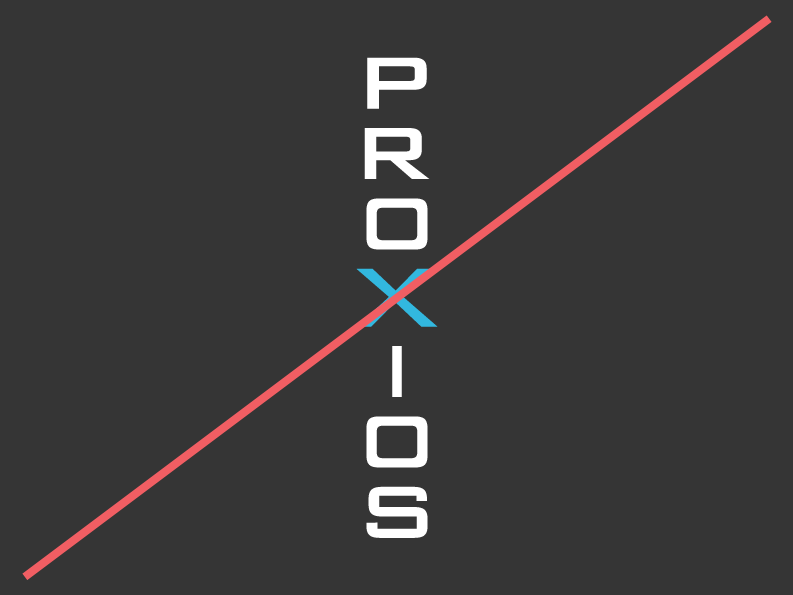
Don't change the colors
Don't tilt or rotate
Don't skew or stretch
Don't use different fonts or re-typset
Don't place on colors with insufficient contrast
Don't rearrange
Color
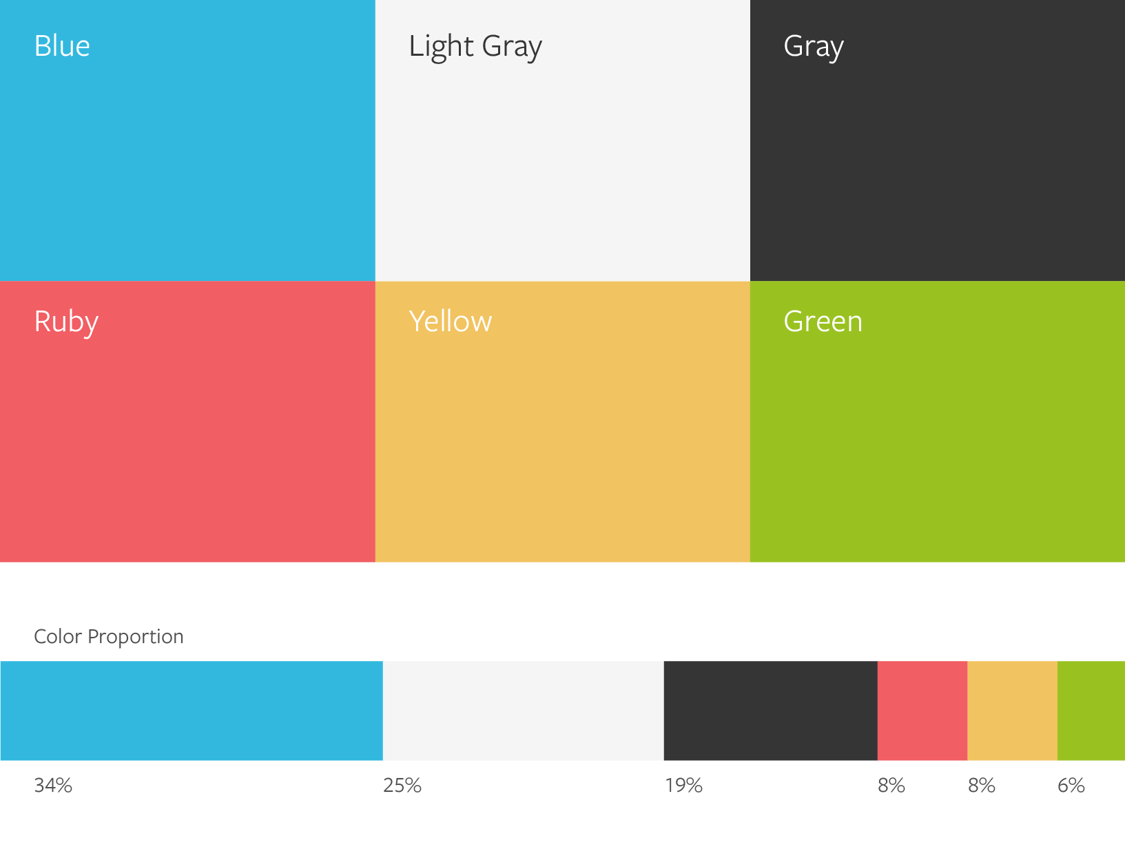
When creating or printing a piece, be sure to double check the colors you are using. Remember, different mediums require different color values, color proportions matter, and some colors are used for specific types of content only.
Basics
Our color palette consists of bright, bold hues juxtaposed with clean white and light gray. Always use specified values to ensure color consistency across all branded materials. Some colors are meant to be used more sparingly than others. The chart below shows the color relationships in a given brand application. These percentages are not compulsory, they are only provided to give a general idea of recommended proportions.
Swatches
When color consistency is imperative, use Pantone values. Coated (C) values are for glossy paper and uncoated (U) values for matte paper.
For general printing, use CMYK, this is often more economical than Pantone.
In digital contexts, like websites and projections, use RGB & Hex values.
The fonts we use and the way we place our content helps our customers and employees sort through information. Adhering to our typography rules will make it easier for people to understand our messages and find what they are looking for.
Basics
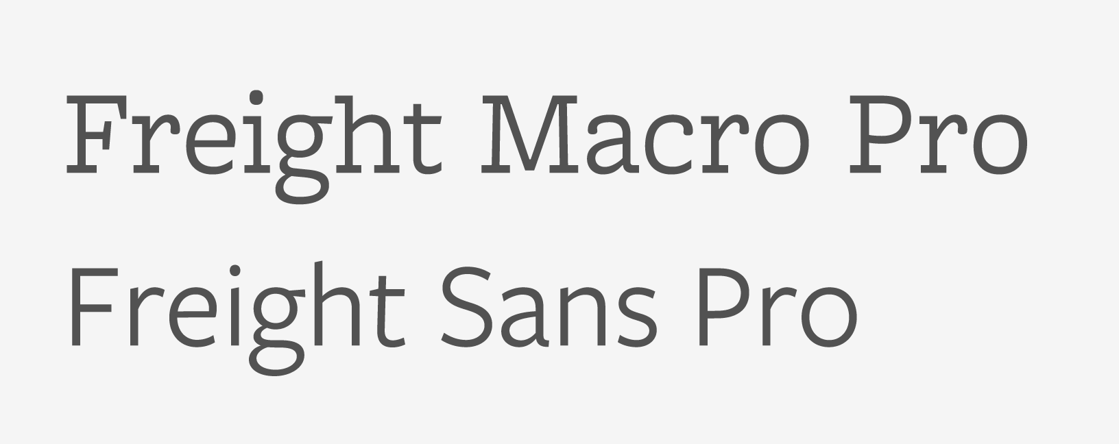
Freight Macro Book Pro and Freight Sans Pro are the typefaces that should be used on all materials from internal communications to external marketing.
Freight Macro Book Pro is our headline typeface. Its strong slab serifs profect confidence and reinforce graphic elements like the underline and spacer.
Freight Sans Pro is our body typeface. Its based on the same proportions as our headline typeface, and its clean lines make it ideal for reading large amounts of text.
Freight Sans Pro—AaBbCcDdEeFfGgHhIiJjKkLlMmNnOoPpQqRrSsTtUuVvWwXxYyZz 0123456789.,;:(?&@$#)\
Type Hierarchy
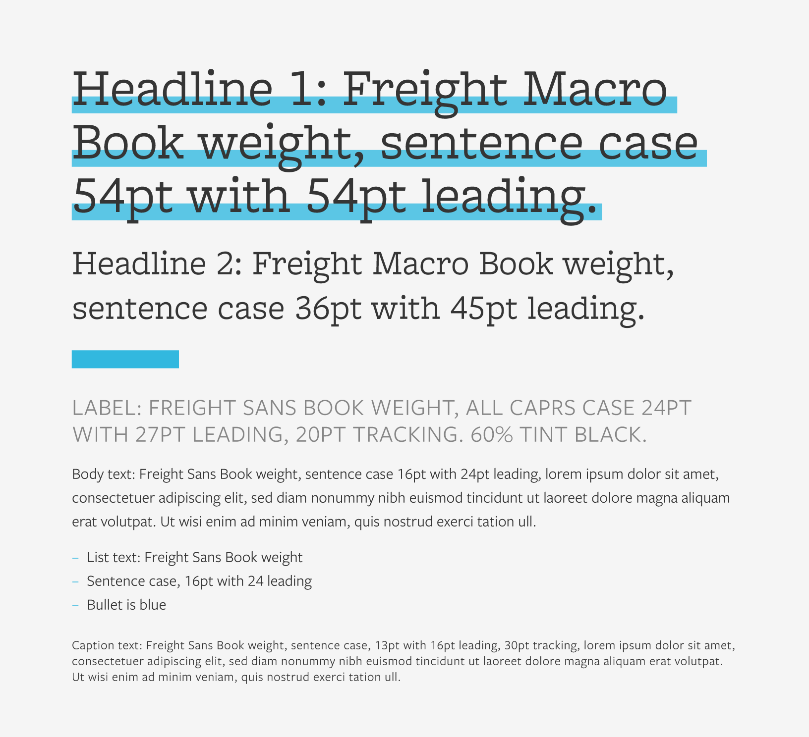
The size of our font will vary across applications, but here are some general rules.
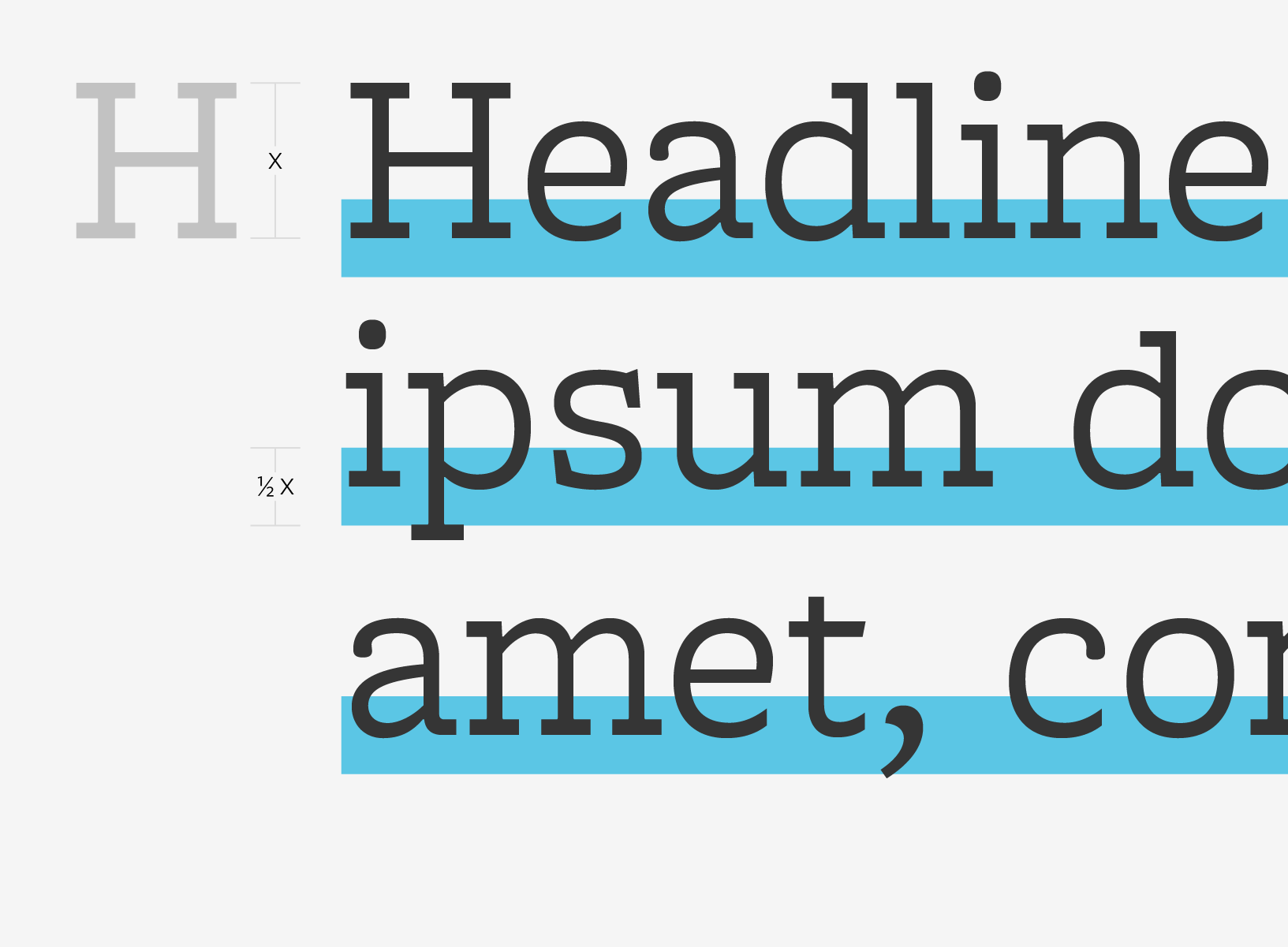
Headlines are best set at 24pt or larger. They should be noticeably bigger than body text. Headlines will be the largest text in a composition. They should be short and important. All headlines should be formatted in sentence case (capitalizing only the first word and ending with punctuation). Primary headlines should have underline formatting (for more information on this see Primary Headlines). A blue spacer is placed between headlines and any content that follows.
Labels are short subheaders that indicate the content that is to follow. They are all caps, 60% of the Gray, and best set slightly larger than the body text.
Body text is best set between 7pt and 19pt, with care given to legibility. There should be a generous amount of spacing between each of the lines (also known as leading).
Lists are set at the same size as body text. Bullets are indicated with a single en-dash. Bullets that are longer than a single line should share the same left indent value.
Captions and fine print are the smallest texts in a composition. They are used sparingly to annotate imagery or detail legal print at the end of an application. They should be noticeably smaller than the body text.
Sample Settings
Our Websafe Typefaces
There are some limitations when it comes to using our brand typefaces on digital platforms, like emails, e-newsletters, and email signatures.
Whenever you are unable to use Freight Macro Pro, use Georgia.
Whenever you are unable to use Freight Sans Pro, use Tahoma.
These are unique design elements that add flavor and personality to our brand, making us recognizable, and memorable. Pay close attention to each asset as they often have different rules for placement.
The Grid
Use a grid to organize content clearly, making alignments based off its columns.
Grid anatomy
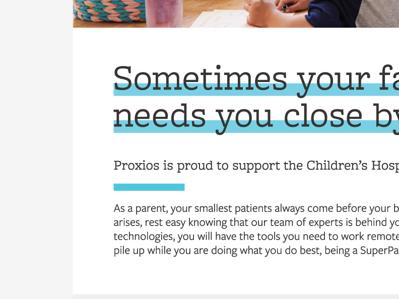
Headline Underlines
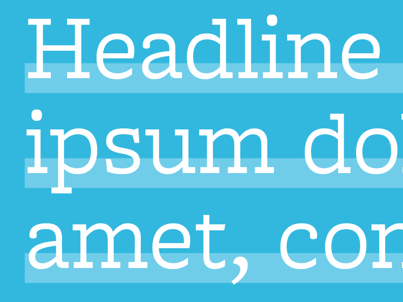
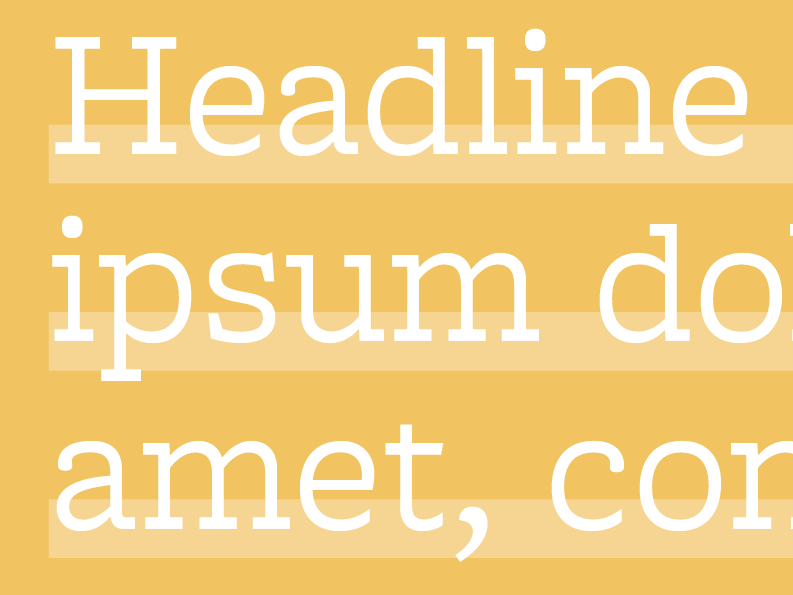
Primary headlines are formatted with an offset underline. This underline is half the height of a capital letter, and is positioned so that it bisects the baseline of a sentence.
When the headline is used on a white background, the underline is an 80% tint of the blue.
When the headline is used on a brand color background, the underline is a 70% tint of the same brand color.
Headline underline anatomy
Headline underline example 1
Headline underline example 2
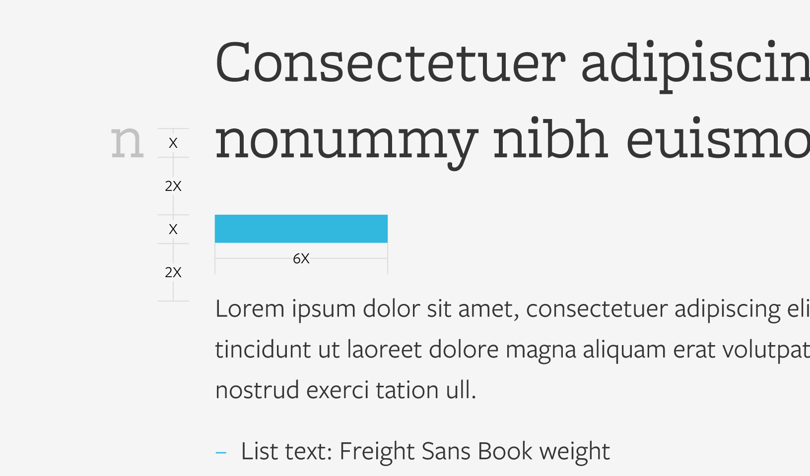
Spacer
The spacer separates secondary headlines from the body text that follows. When using spacers, take care to provide enough space in between each element.
Spacer anatomy
Spacer example 1
Spacer example 2
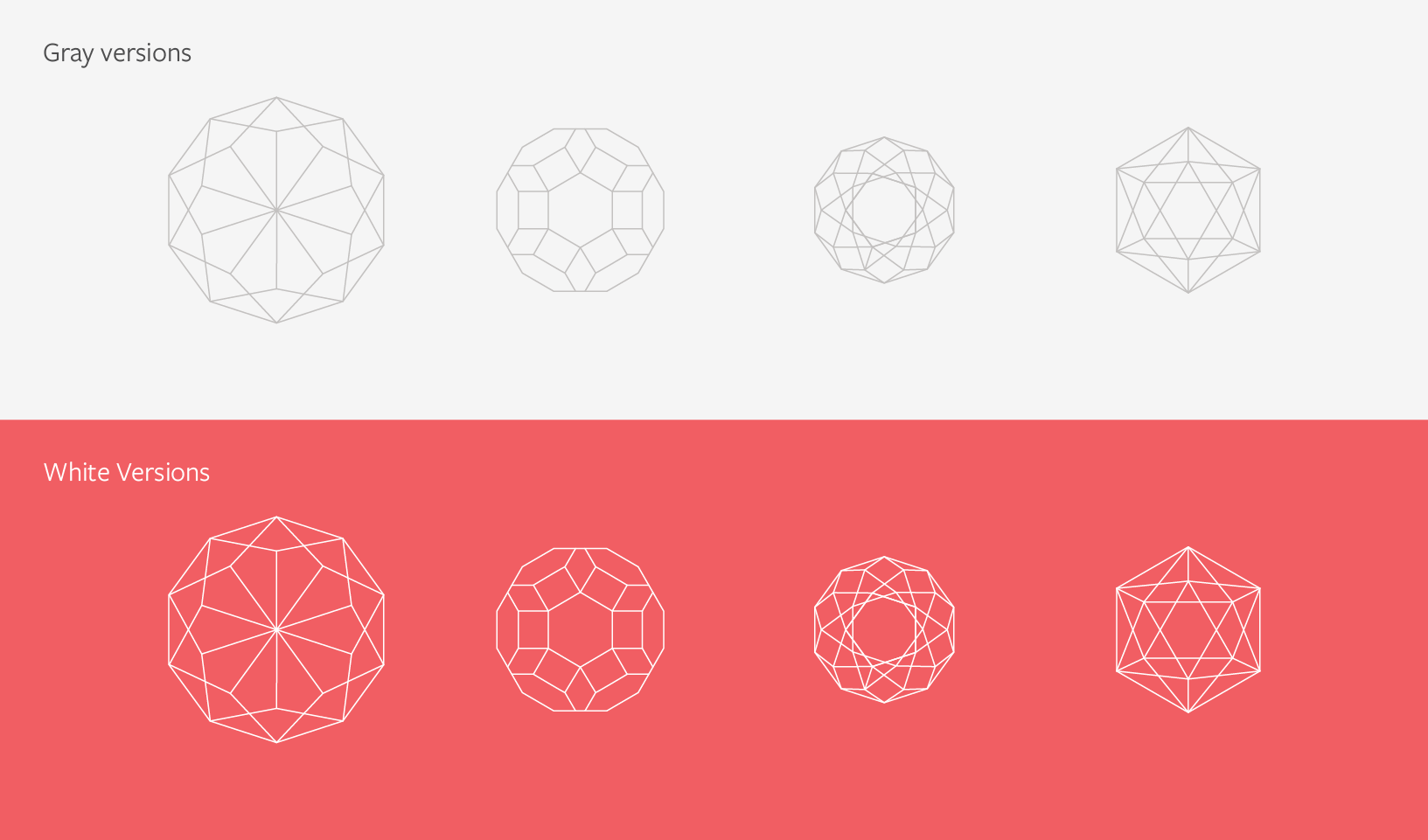
Polyhedrons
Polyhedrons are line-based geometric shapes that are used as accents in an application. Here are some things to remember.
Always position so that part of the shape is running off the edge. Care should be given to placement — a polyhedron should never obscure an important part of an image or overlap with any typography.
On white backgrounds, the light gray versions are used.
On colored backgrounds, the white version should be used.
Polyhedron anatomy
Polyhedron example 1
Polyhedron example 2
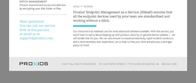
Footer
Use the footer goes at the end of an application. It should contain supporting content, contact information, and fine print. The footer is filled with the Light Gray.
Footer example 1
Footer example 2
Solutions Icons
Each of our solutions has an icon. They are often used in conjunction with one another. Remember, icons aren’t used for anything but their associated solution.
Our illustration style is rooted in simplicity. All objects are made from basic shapes like squares, circles, and triangles. All colors are tints from the brand palette.
Example of illustration style
Applications
Here’s our visual style in action. Observe all of our assets working together to create a cohesive and well positioned brand. When creating new applications, it’s great to compare them with these examples to ensure they fit in seamlessly.
Physical Applications
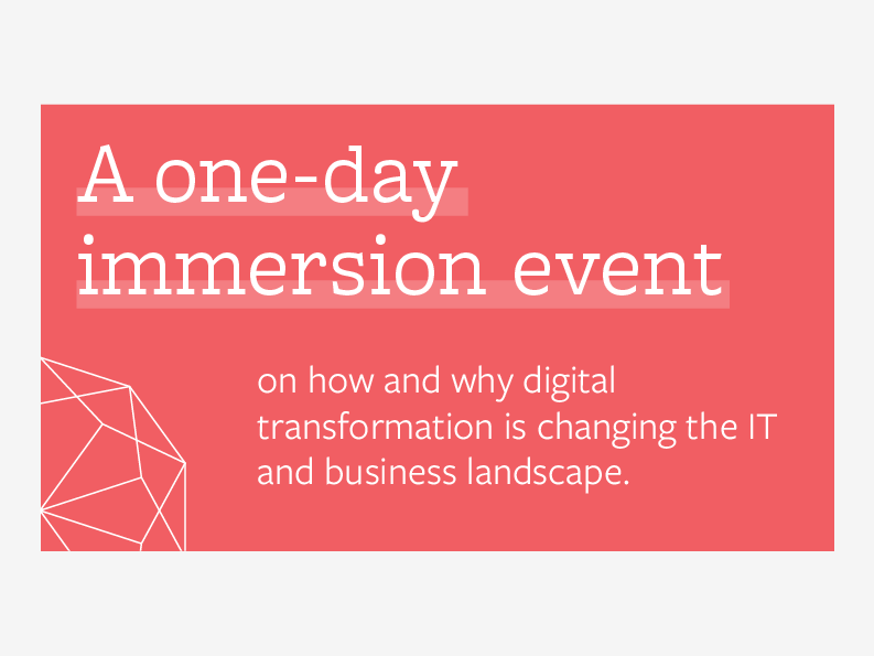
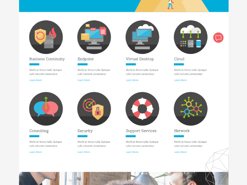
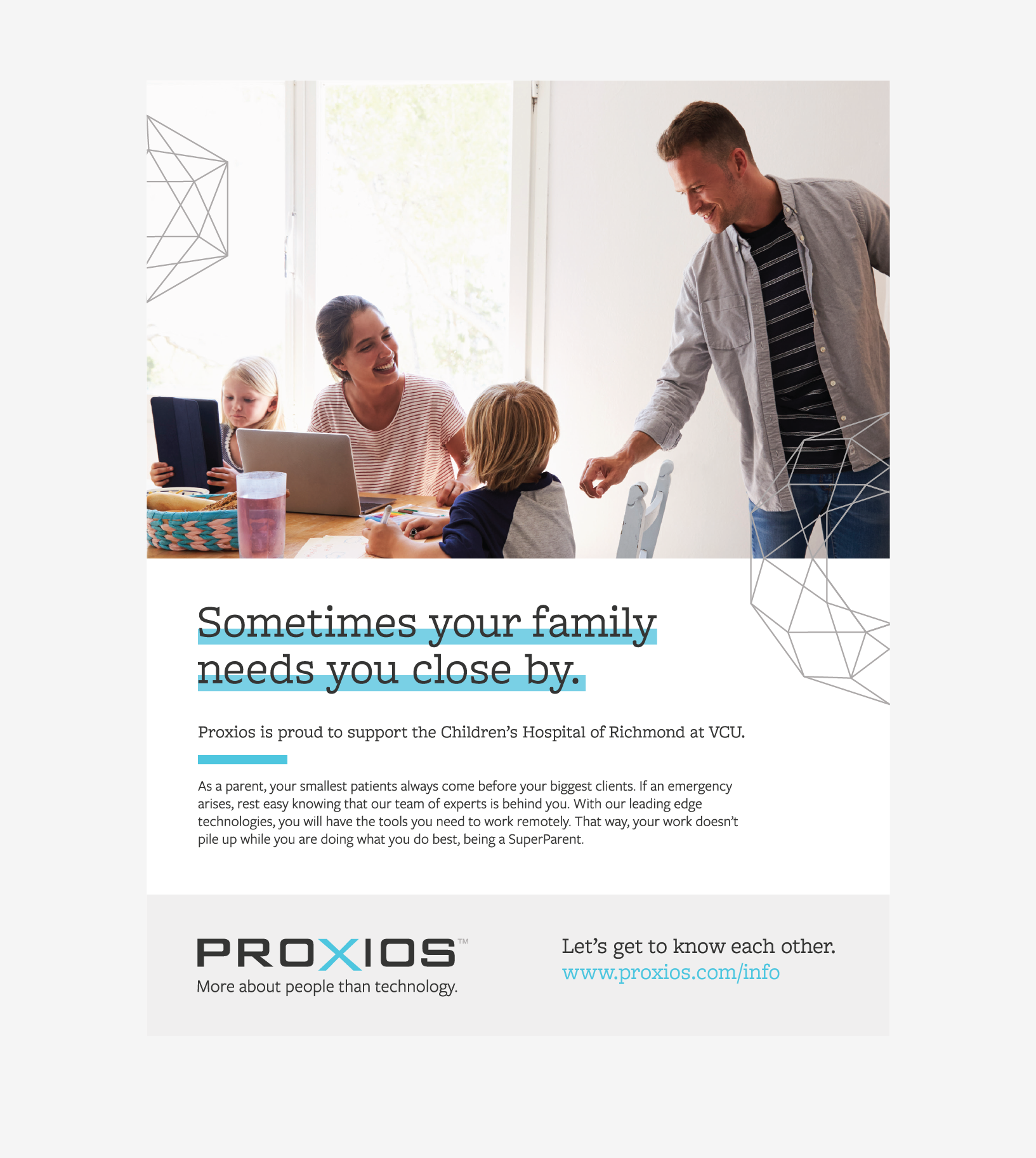
Banner
Print Ad
Digital Applications
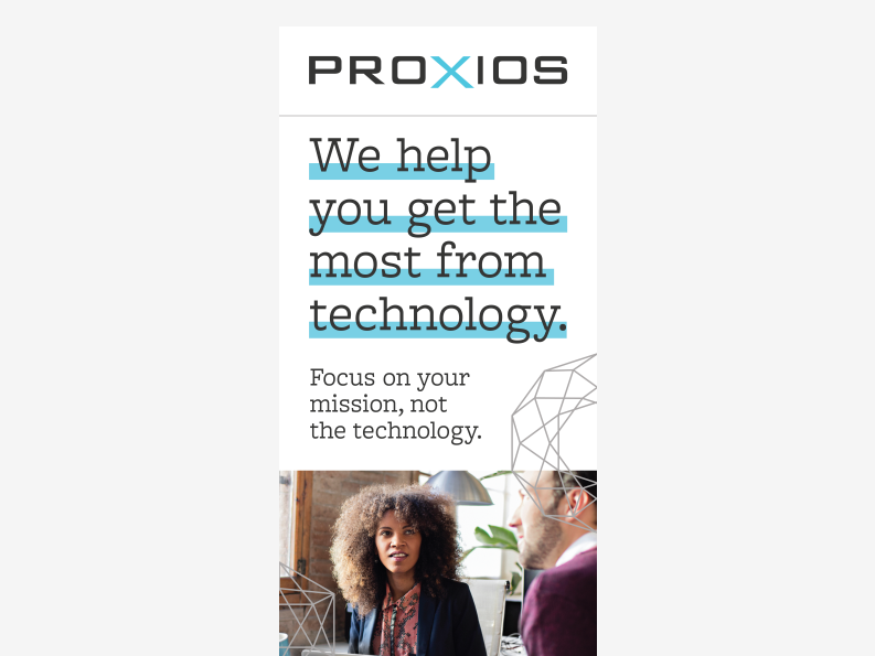
Website
Photography
Basics
Select images that reinforce our core messaging, voice and tone. Real locations and situations are preferred where subjects are in their natural setting and not looking directly at the camera. Keep the end audience in mind when selecting images.
Ask yourself, does this feel relatable? Is it timely? Is it natural? Consider images with a similar depth of field, coloring, and feel as the examples below. Stay away from anything that looks posed or staged.
examples of photography style
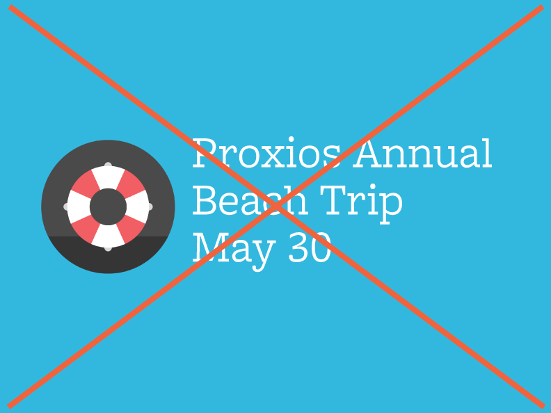
Photography Do's and Don'ts
Don't use photos that lack a setting
Don't use photos that have artificial overlays
Asset Downloads
Whether it is your first time reviewing this Brand Suitcase or the 132nd, it is always smart to revisit the rules and recommendations for the specific files you are downloading. Keep in mind, this platform will continually be updated as the brand progresses — so be sure to check back with each new project.


