Brand Essence
Abrasive Products for Wood and Concrete Floor Refinishing.
Last Updated February 19, 2025
Outlined here are the foundational messages that keep your company rooted and standing tall.
Abrasive Products for Wood and Concrete Floor Refinishing.
Concierge-level customer service, affordable investments and superior product performance.
As a smaller company, we are more nimble than our competitors and our customer care team provides a personal touch.
Real. Rugged. Ready. It really says what we are: a durable product that is ready when you need it.
Follow these rules to ensure your brand is talked about in a consistent manner.
Always refer to Virginia Abrasives using the full name.
Never use VA or any other acronyms when referencing Virginia Abrasives.
We are one of only five companies in the US producing sandpaper abrasives. We are a premier brand serving the rental industry and a growing brand in the professional wood flooring industry.
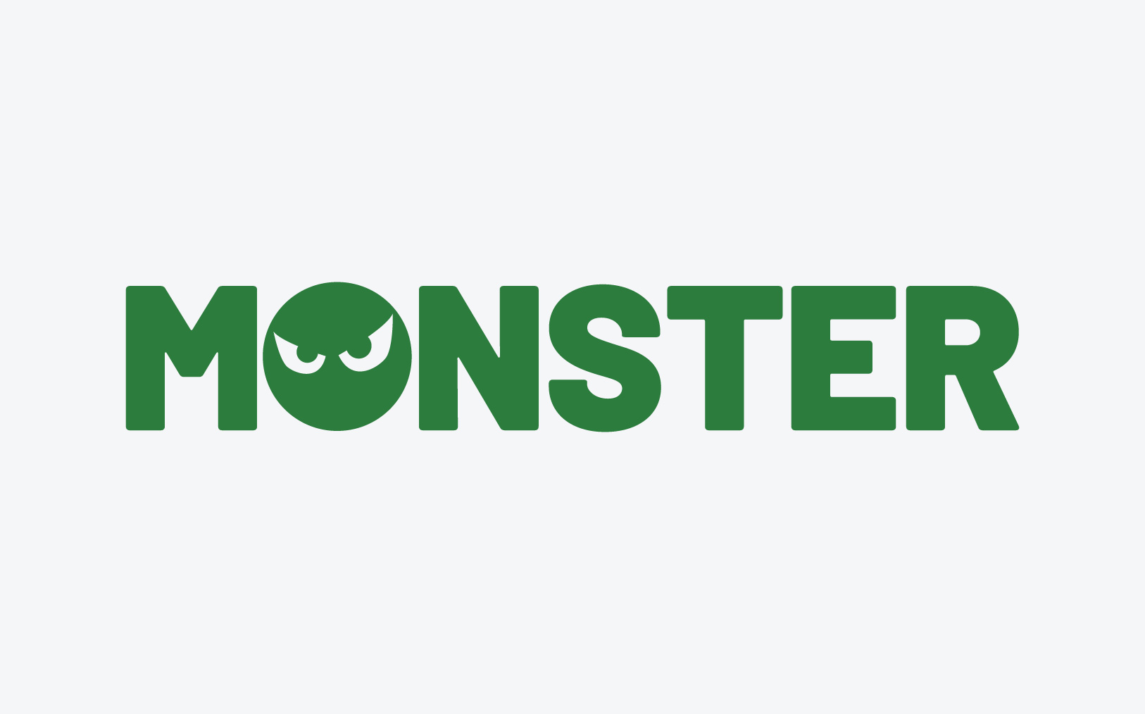
Monster Sanding Abrasives are Engineered for Professional Flooring.
Abrasives Made for the Toughest Jobs.
Terrifyingly Good.
The Right Start to a Great Finish.
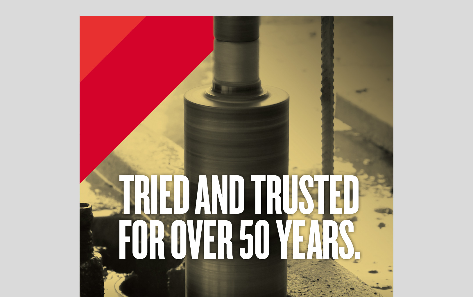
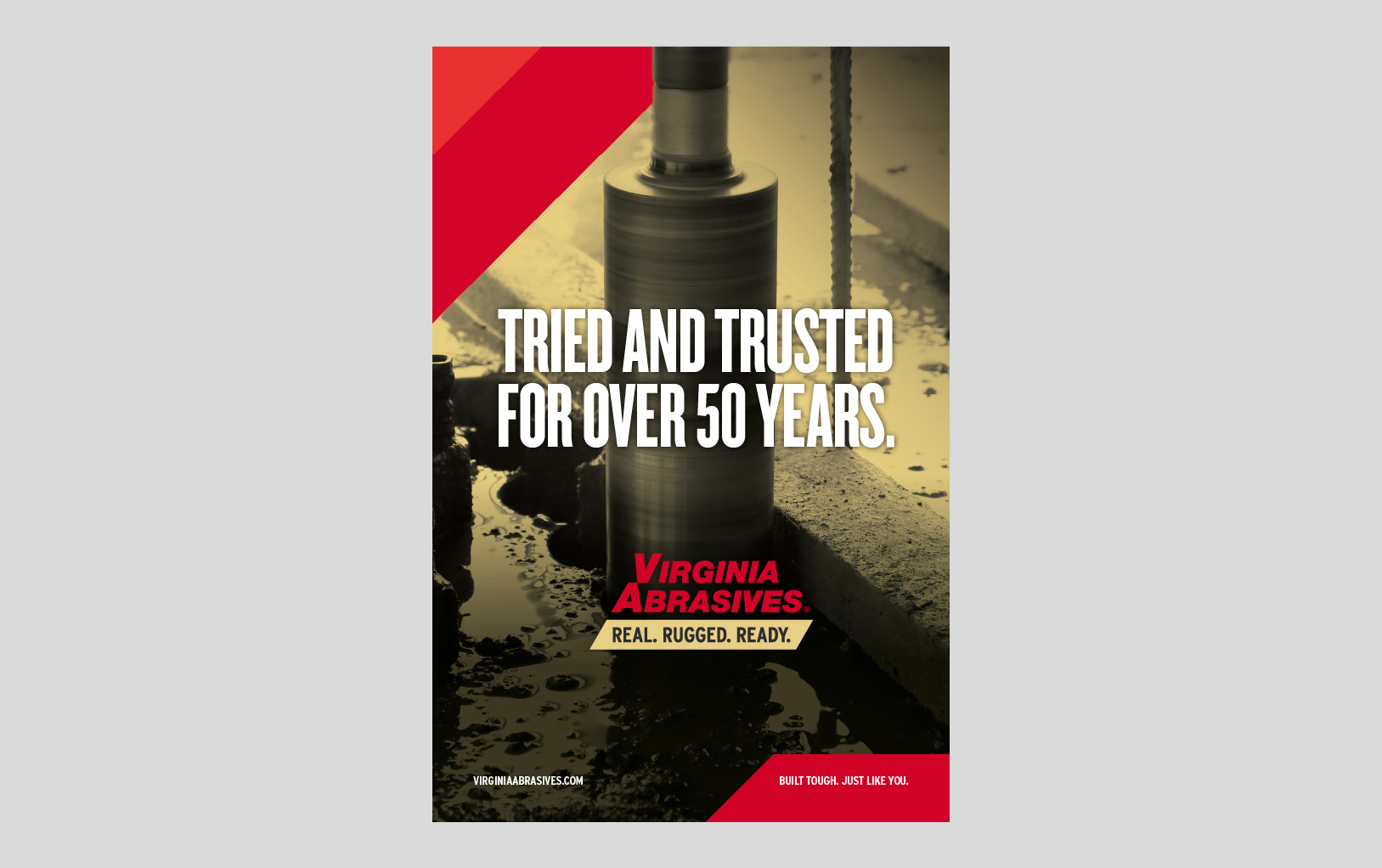
Tried and trusted for over 50 years.
Built tough. Just like you.
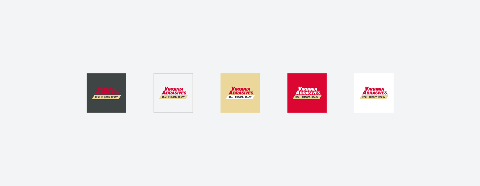
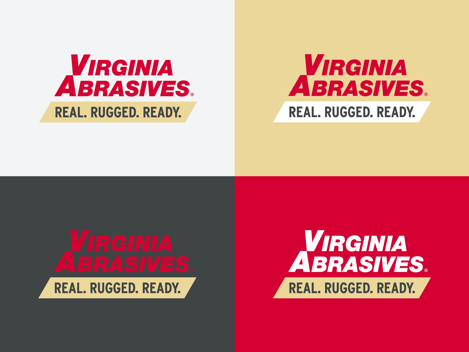
Logos are key brand identifiers — that is why it is imperative that ours is always placed consistently.
To ensure maximum contrast and visibility, follow these rules:
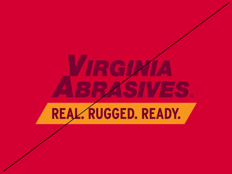
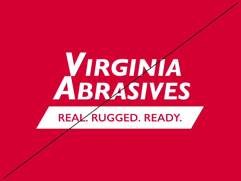
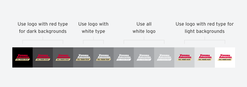
On dark backgrounds, use logos with a red “Virginia Abrasives.”
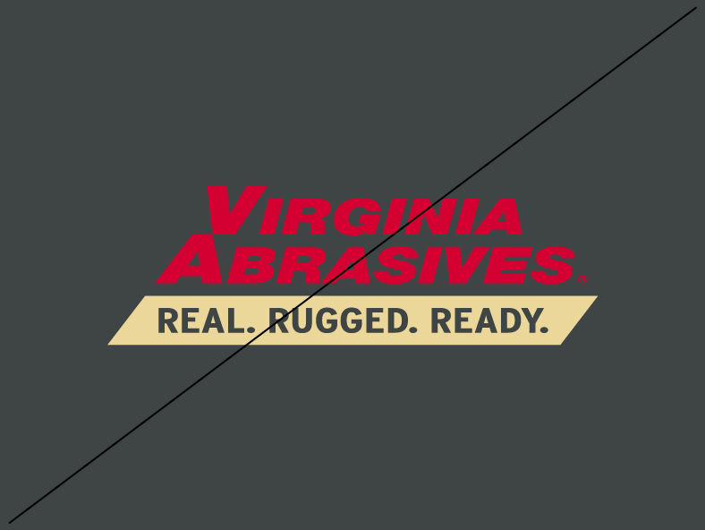
On medium-contrast backgrounds, use logos with a white “Virginia Abrasives.”
On light backgrounds, use logos with a red “Virginia Abrasives.”
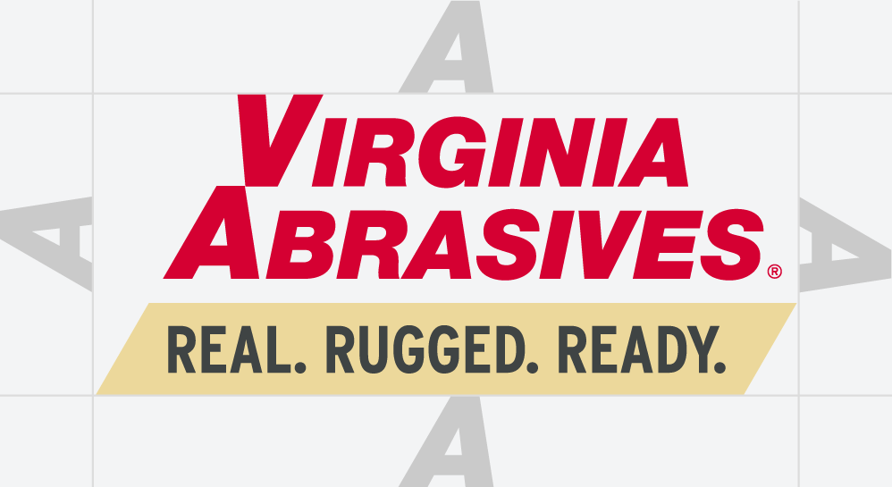
Your logo should always be placed consistently so that it is easy to find. Start by ensuring appropriate space around the logo–it should never be lost amongst other logos or graphics. Following these minimum clear space guidelines will ensure clarity and legibility of your mark.
Keep at least an A’s worth of negative space between the logo and other elements.
Never use the logo at dimensions smaller than the specified minimum size.
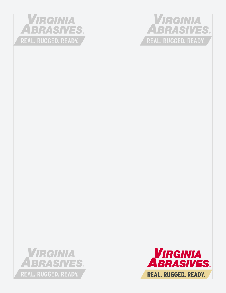
The Virginia Abrasives logo should either appear in the center of a piece or in one of its four corners.
Only use the approved and provided logos. These can be downloaded in Asset Downloads. Never alter the logo files. Do not add shadows, patterns, intricate backgrounds, or other effects.
Don’t change the color of the logo.
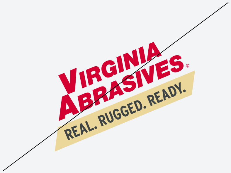
Don’t rotate the logo.
Don’t distort the logo.
Don’t re-typeset the logo.
Don’t place on a background with insufficient contrast.
Don’t create additional lock-ups.
Selecting which version of your logo to use can be tricky. Use this spectrum to help you decide which will provide the most contrast. Some trial and error may be necessary.
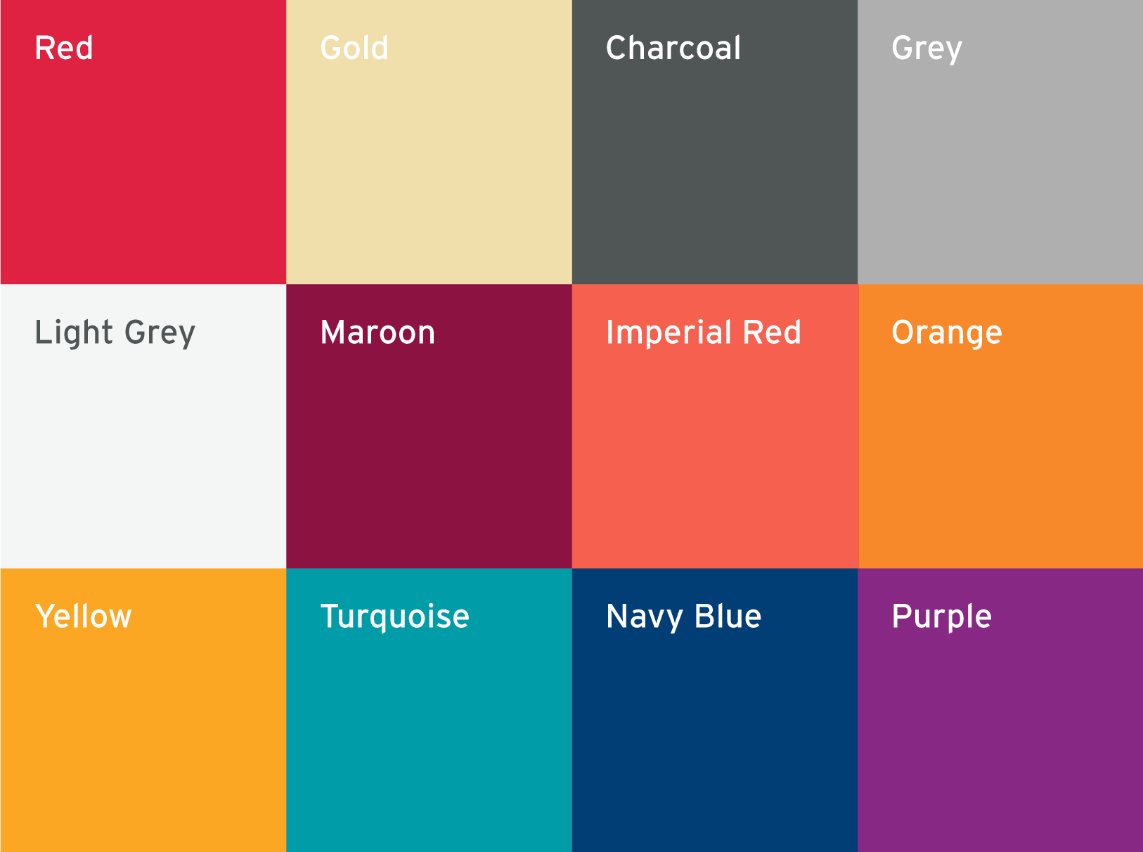
When creating or printing a piece, be sure to double check the colors you are using. Remember, different mediums require different color values, color proportions matter, and some colors are used for specific types of content only.
Red, gold and charcoal should account for the majority of a given brand application. The imperial red, navy blue, maroon, yellow, turquoise, and purple are supplemental colors.
Color consistency across all brand materials is key. Here’s what you need to know.
Use Pantone values when color consistency is imperative. Use coated (C) values for glossy paper and uncoated (U) values for matte paper.
Use CMYK values for typical printing. CMYK is often more economical than Pantone, but can be less consistent across printing processes.
Use RGB & Hex values for digital use like websites, screens and projection.
Pantone
200U
199C
CMYK
00 100 72 00
RGB
213 00 50
Hex
#d50032
Pantone
7402U
7402C
CMYK
08 13 50 00
RGB
236 216 155
Hex
#ecd89b
Pantone
447U
446C
CMYK
00 00 00 90
RGB
63 68 68
Hex
#3f4444
CMYK40 33 33 00
RGB159 159 160
Hex#9f9fa0
CMYK04 02 03 00
RGB241 242 242
Hex#f1f2f2
Pantone
7421C
CMYK
33 100 64 39
RGB
120 0 50
Hex
#780032
Pantone
CMYK
00 87 80 00
RGB
240 73 62
Hex
#f0493e
Pantone
157C
CMYK
0 67 99 0
RGB
244 117 33
Hex
#f47521
Pantone
144C
CMYK
0 48 98 0
RGB
248 151 29
Hex
#f8971d
Pantone
321C
CMYK
84 28 37 2
RGB
0 140 153
Hex
#008c99
Pantone
282C
CMYK
100 89 34 25
RGB
0 45 98
Hex
#002d62
Pantone
260C
CMYK
66 100 22 9
RGB
113 20 113
Hex
#711471
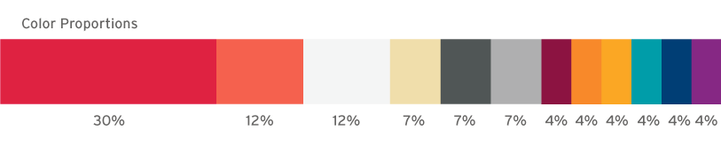
Use the specified values to ensure color consistency across all branded materials. Some colors are meant to be used more sparingly than others. The chart below shows the color relationships in a given brand application. These percentages are not compulsory, they are only provided to give a general idea of recommended proportions.
The fonts we use and the way we place our content helps our customers and employees sort through information. Adhering to our typography rules will make it easier for people to understand our messages and find what they are looking for.
Knockout and Interstate are the typefaces that should be used on all materials from business cards to signage.
Knockout is a sans-serif typeface designed by Jonathan Hoefler and Tobias Frere-Jones. Its supercondensed letterforms harken back to nineteenth century American wood type and convey a sense of ruggedness and confidence.
Interstate is a typeface designed by Frere-Jones. The design of Interstate was based on the letters found on US highway signs. In addition to complimenting the American flavor of Knockout, Interstate’s clear legibility at a distance and clearly-differentiated letterforms make it an natural choice for body text.
Knockout Full Bantamweight—AaBbCcDdEeFfGgHhIiJjKkLlMmNnOoPpQqRrSsTtUuVvWwXxYyZz
0123456789.,;:(?&@$#)\
Knockout Welterweight—AaBbCcDdEeFfGgHhIiJjKkLlMmNnOoPpQqRrSsTtUuVvWwXxYyZz
0123456789.,;:(?&@$#)\
Interstate Bold Condensed—AaBbCcDdEeFfGgHhIiJjKkLlMmNnOoPpQqRrSsTtUuVvWwXxYyZz
0123456789.,;:(?&@$#)\
Interstate Regular—AaBbCcDdEeFfGgHhIiJjKkLlMmNnOoPpQqRrSsTtUuVvWwXxYyZz
0123456789.,;:(?&@$#)\
Interstate Regular Condensed—AaBbCcDdEeFfGgHhIiJjKkLlMmNnOoPpQqRrSsTtUuVvWwXxYyZz
0123456789.,;:(?&@$#)\
The size of your font will vary across applications, but here are some general rules:
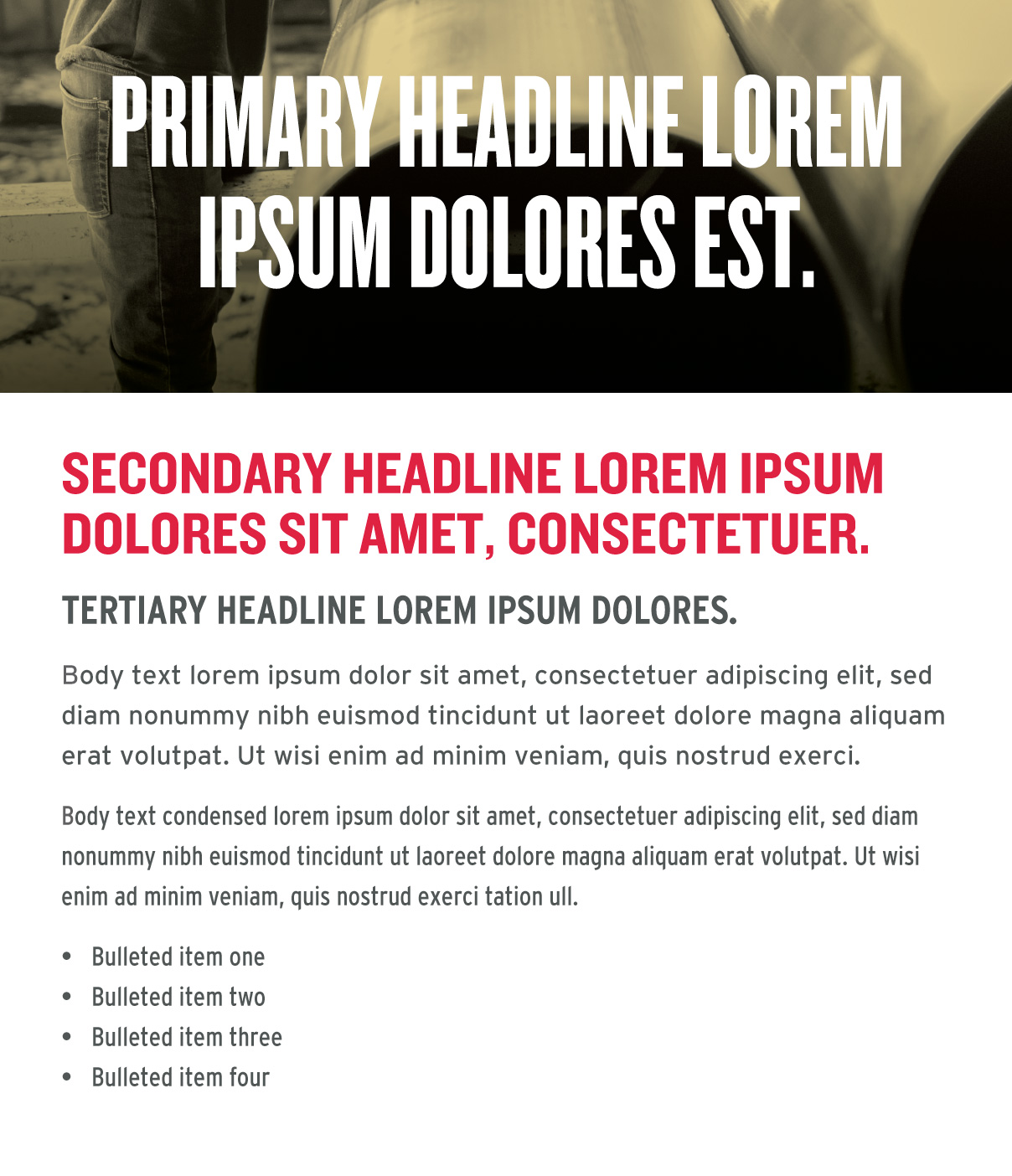
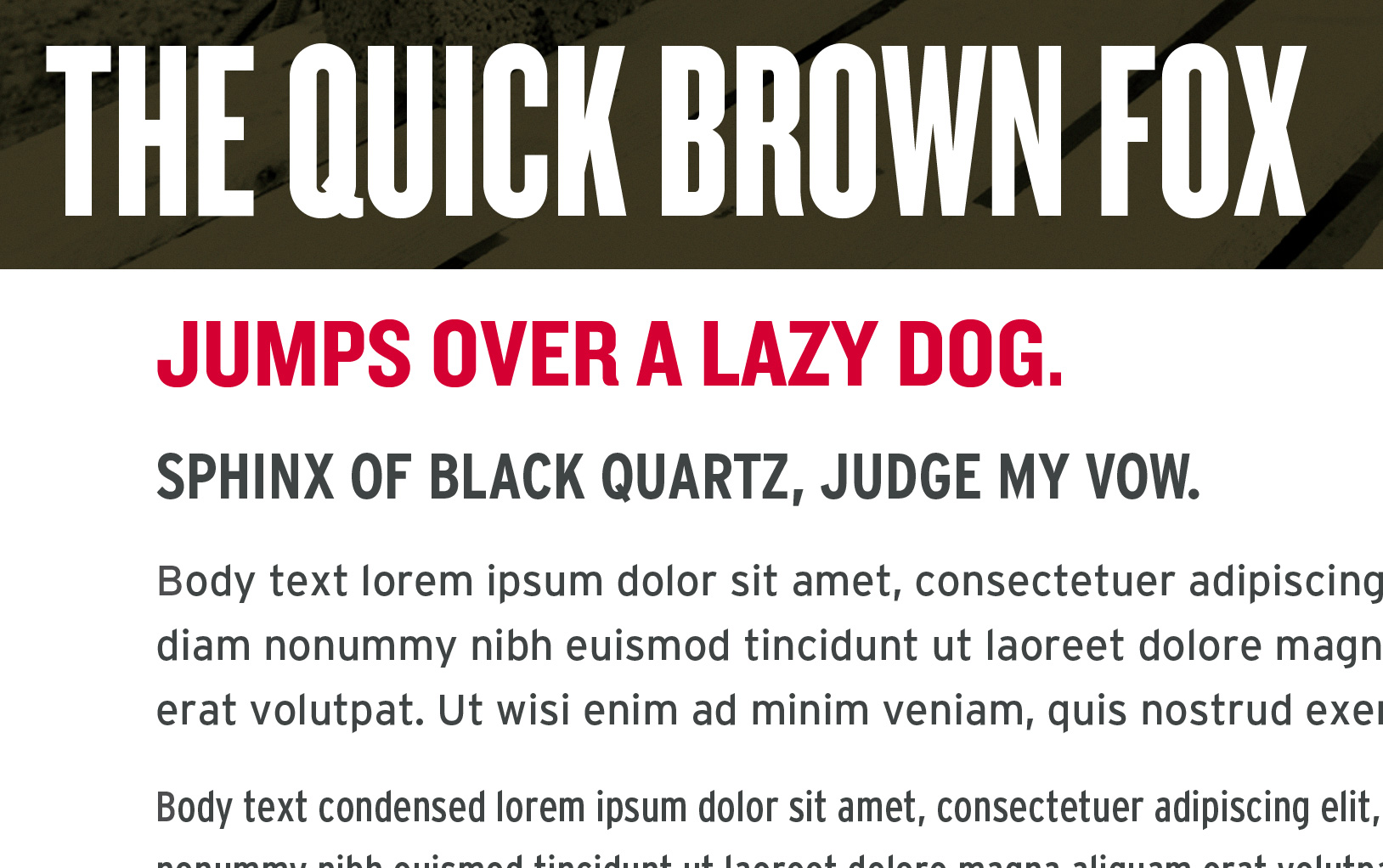
Primary headlines are best set at 54pt or larger. They should be noticeably bigger than body text. Primary headlines will be the largest text in a composition. They should be short and important. All headlines should be formatted in all uppercase.
Secondary headlines are typically set in red. They should be noticeably smaller than primary headlines, and noticeably larger than tertiary headlines. All headlines should be formatted in all uppercase.
Tertiary headlines should be noticeably smaller than secondary headlines, and noticeably larger than body text. All headlines should be formatted in all uppercase.
Body text is best set between 7pt and 19pt, with care given to legibility. There should be a generous amount of spacing between each of the lines (also known as leading) for easy legibility. Body text should be noticeably smaller than the headlines.
Body text condensed should be set in the same way as body text. Use body text condensed when space is an issue.
Lists should be set in the same way as body text.
There are some limitations when it comes to applying your brand typefaces to HTML applications like email.
Whenever you are unable to use Knockout or Interstate Bold Condensed for headlines, use Arial. Arial can also be used in place of Interstate Regular and Interstate Regular Condesnsed for body text and lists.
Arial—AaBbCcDdEeFfGgHhIiJjKkLlMmNnOoPpQqRrSsTtUuVvWwXxYyZz
0123456789.,;:(?&@$#)\
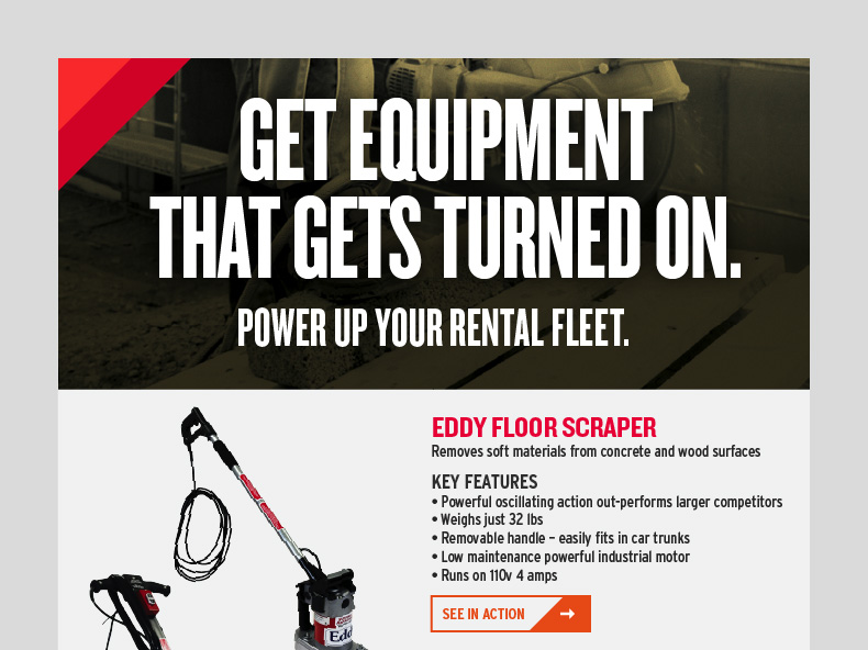
Primary headlines only occur once in a given composition. They are typically centered and white, appearing over a hero image.
Always make sure there is a sufficient amount of contrast off of the background.
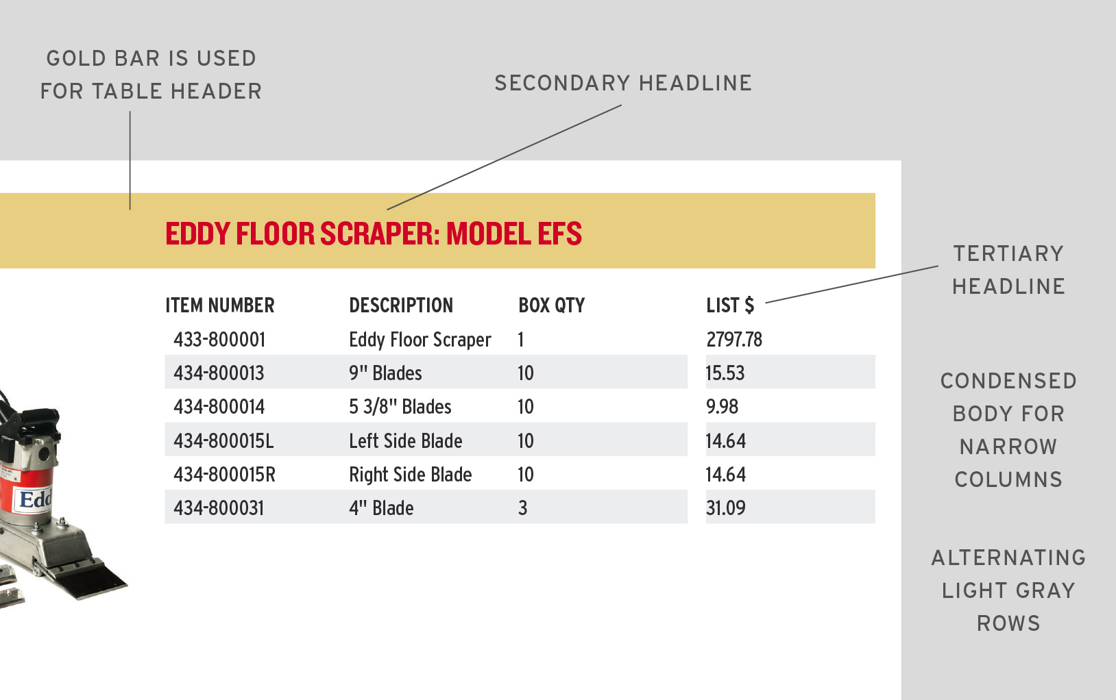
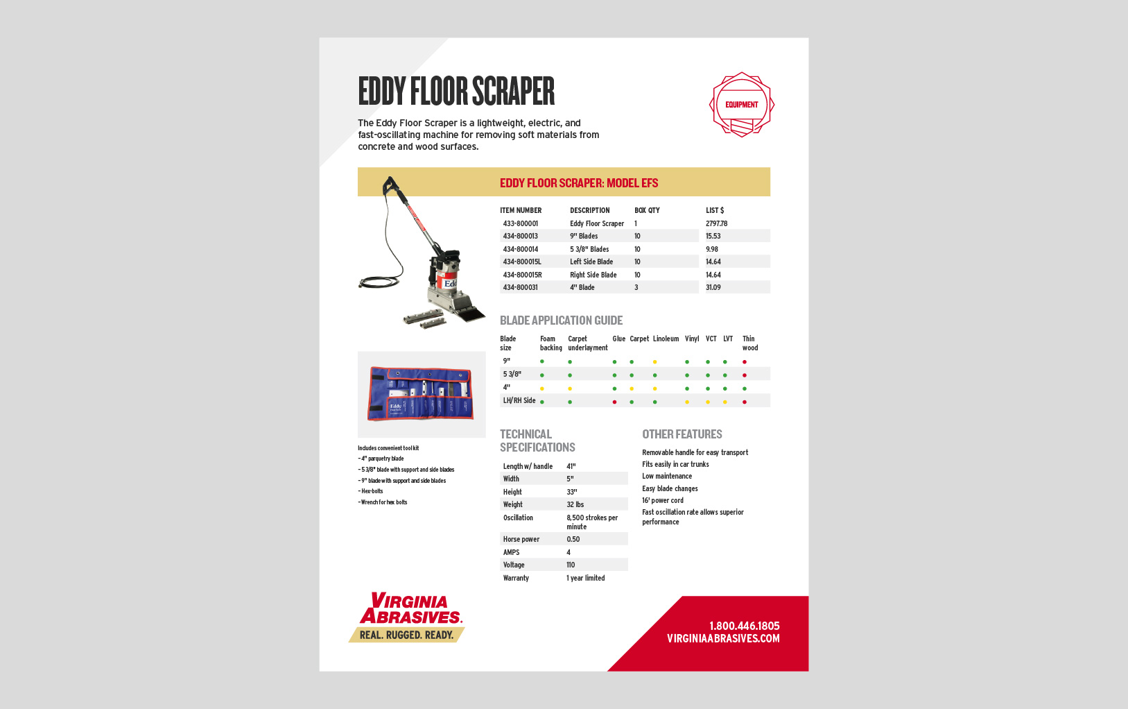
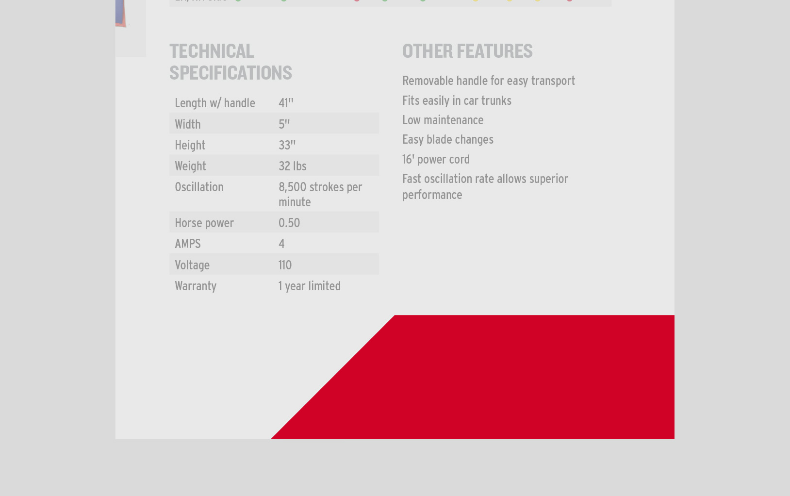
Use the following as a reference when formatting tables.
These are unique design elements that add flavor and personality to our brand, making us recognizable and memorable. Pay close attention to each asset as they often have different rules for placement.
Use a grid to organize content clearly, making alignments based off its columns.
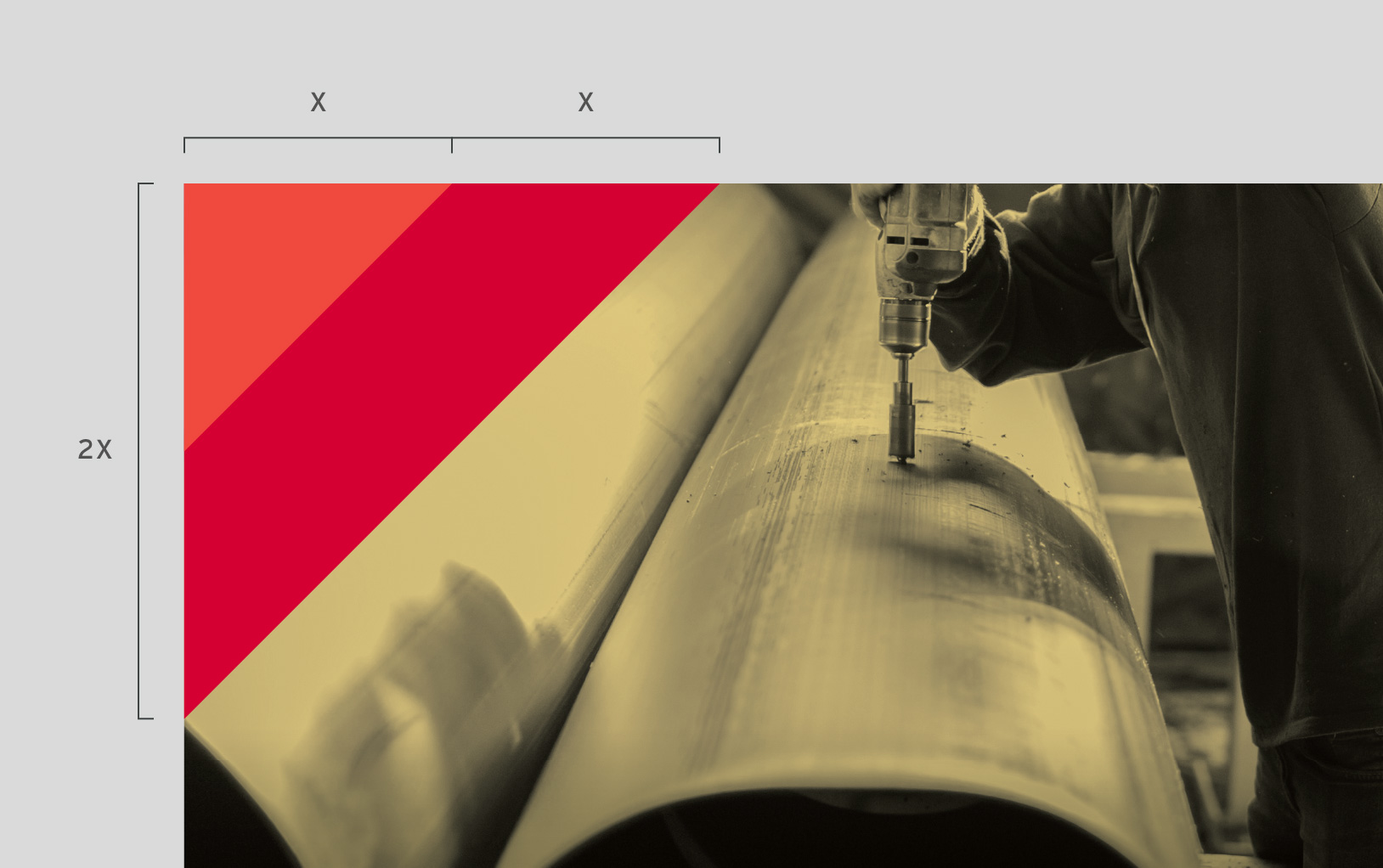
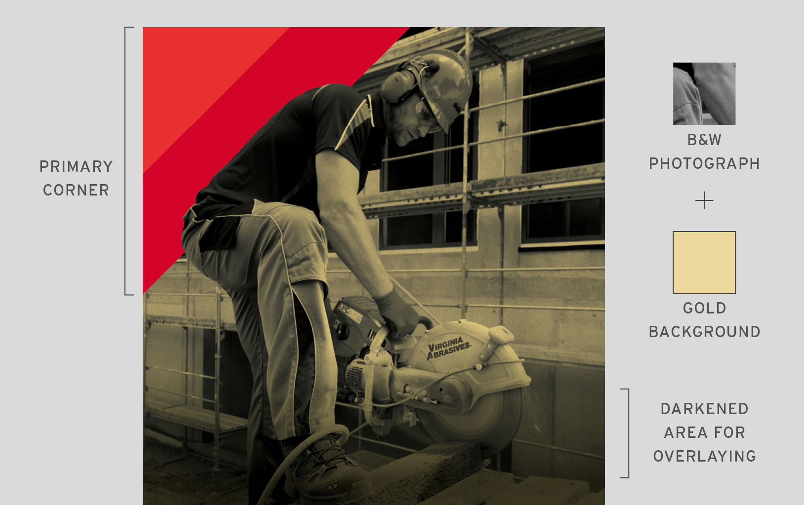
The Corner is one of our defining graphic elements. Here are some things to keep in mind.
The Corner always exists in the upper left. Its diagonal is always 45˚.
The Primary Corner is Imperial Red and Red.
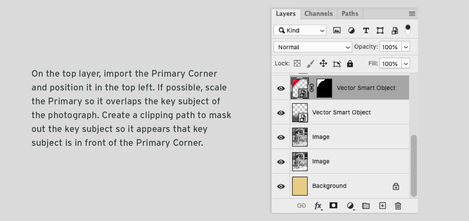
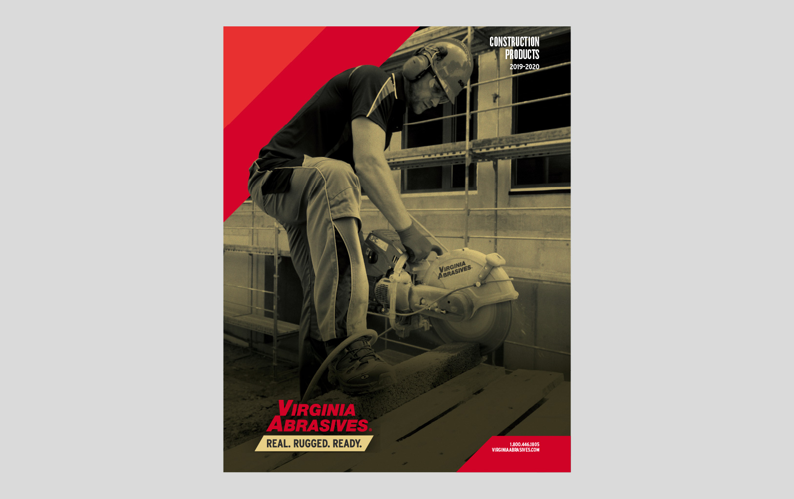
The Primary Corner only occurs once in an application. It is always used in concert with a hero image. Sometimes a clipping mask is used to place the Primary Corner behind elements of the hero image.
The Secondary Corner is Light Grey. It is used in supporting contexts like interior pages, or when space does not allow for the Primary Corner.
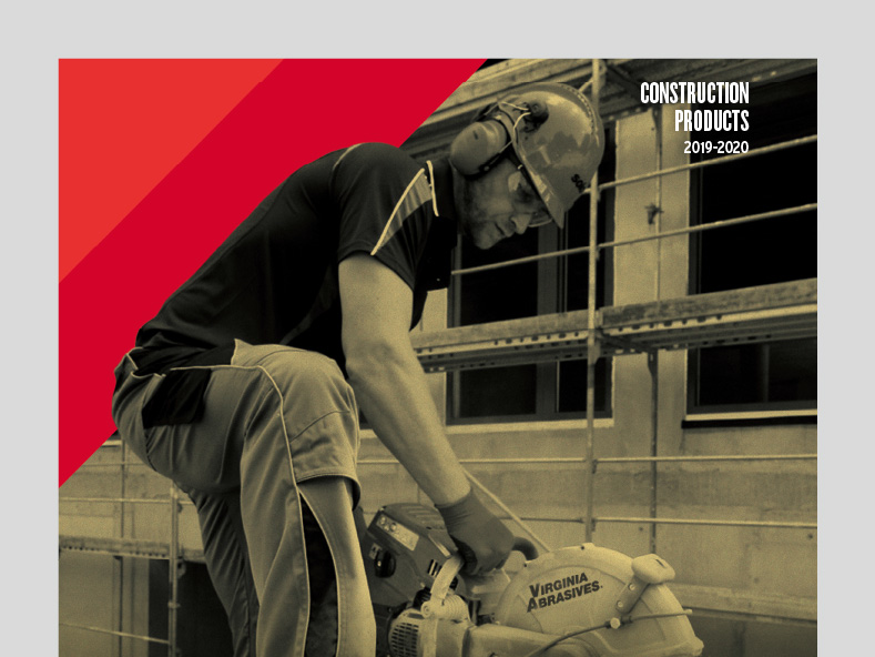
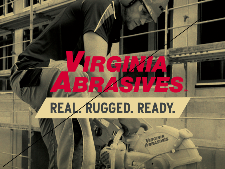
The hero image is a gold-toned photograph with a strong focal point. It is used in primary and introductory contexts like title slides, catalog covers, or the top of a web page.
It occurs once in an application.
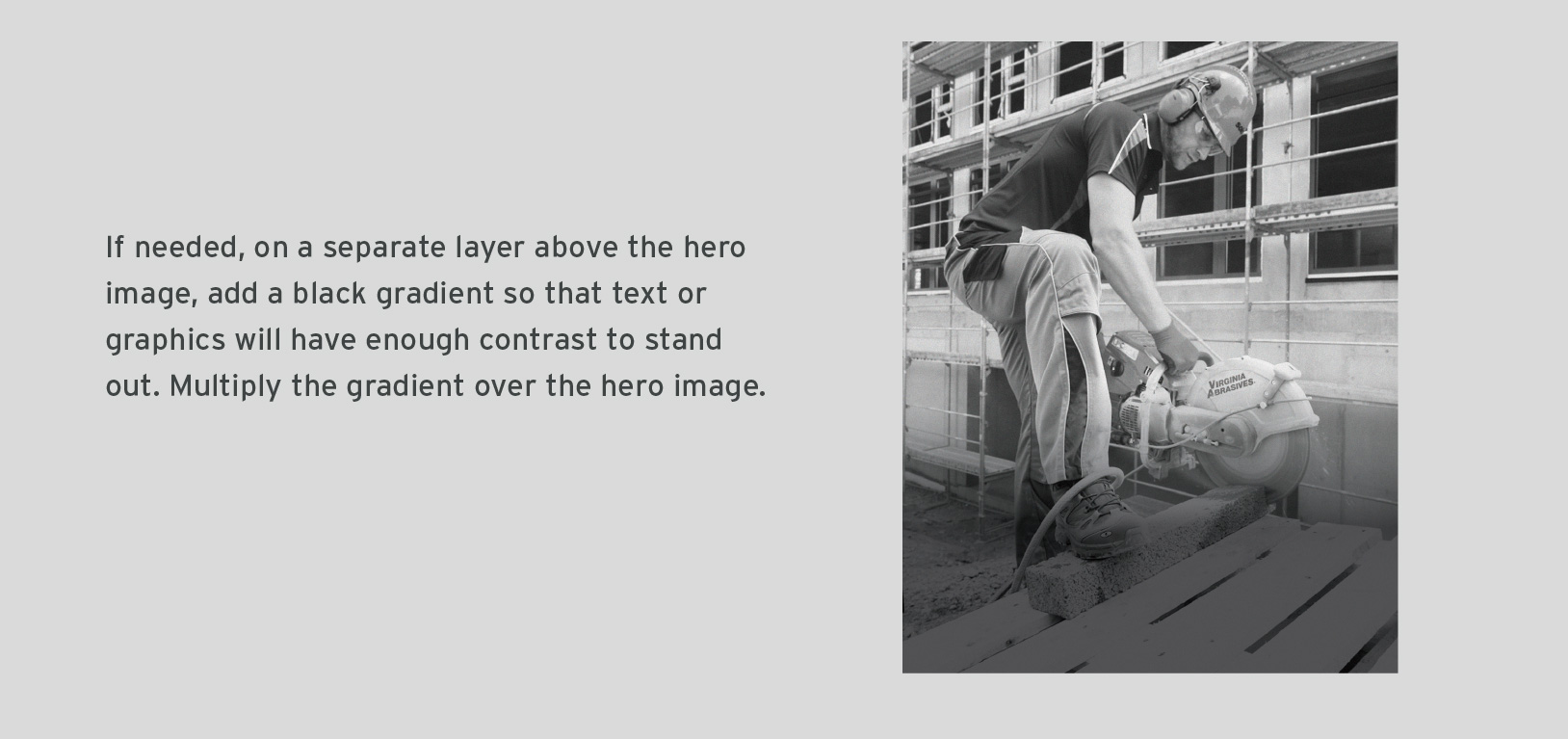
Sometimes parts of the hero image are darkened to create enough contrast for text or other graphics to be placed on top.
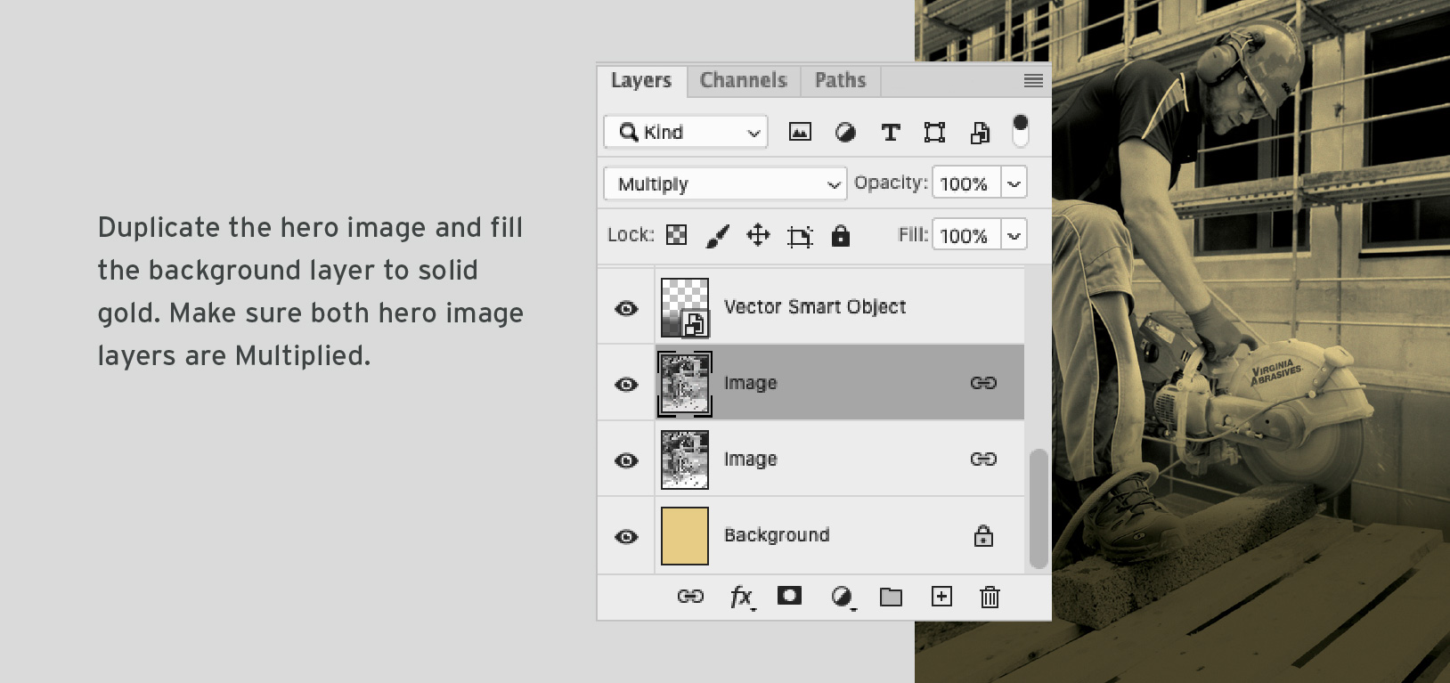
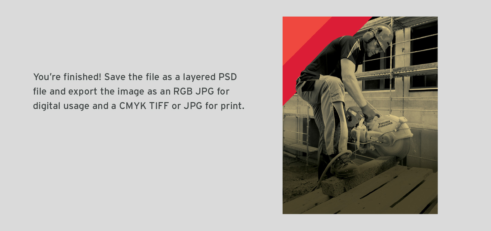
To turn a photograph into a hero image, follow the steps below.
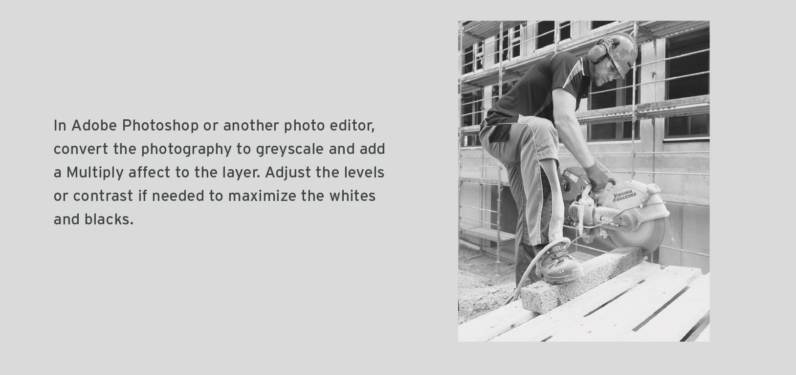
A call to action is a short imperative that encourages the reader or user to take an action. Indicating call to actions consistently will help guide your audience through materials.
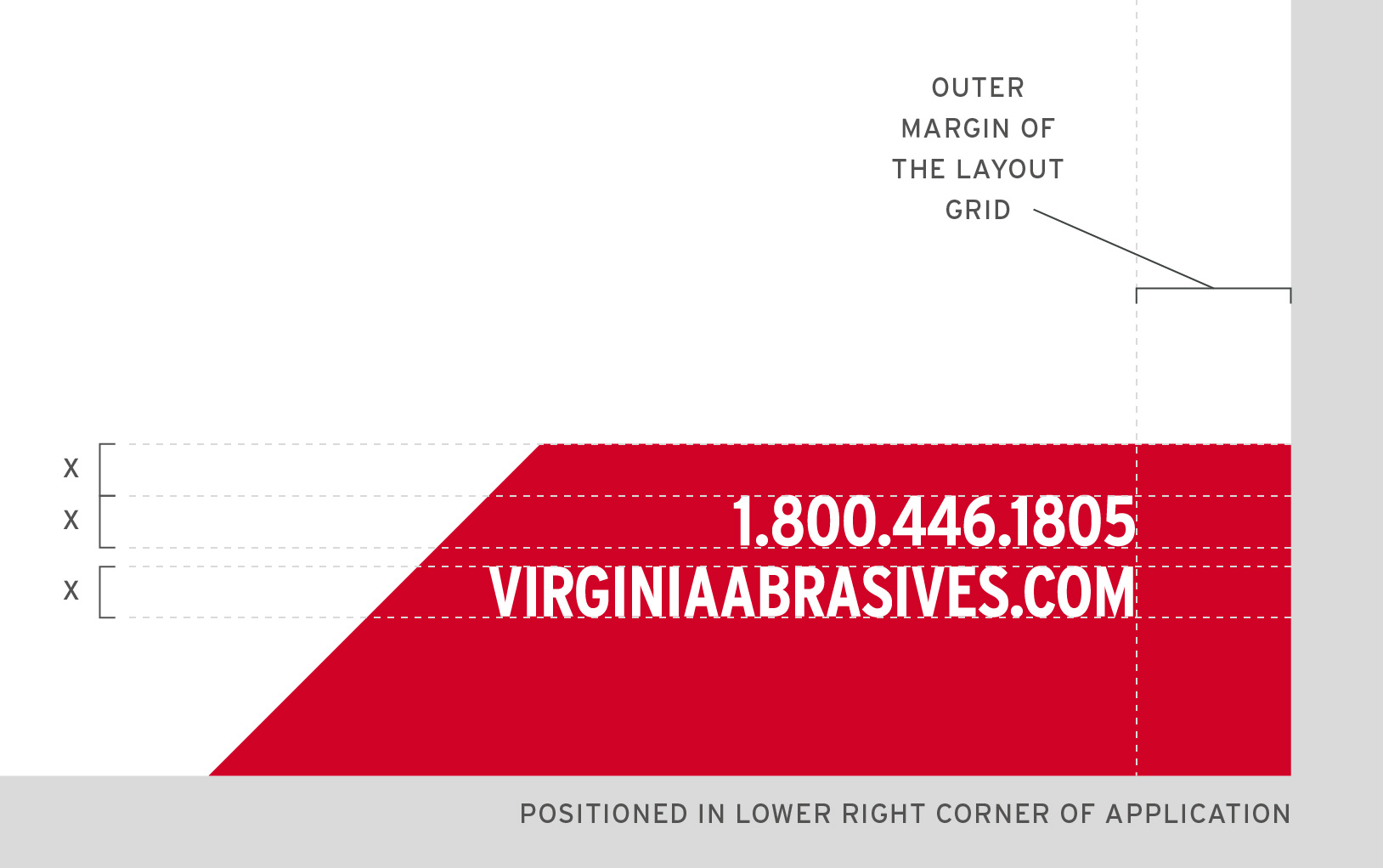
Calls to action always are placed in the lower right.
They consist of white type contained in a red trapezoid.
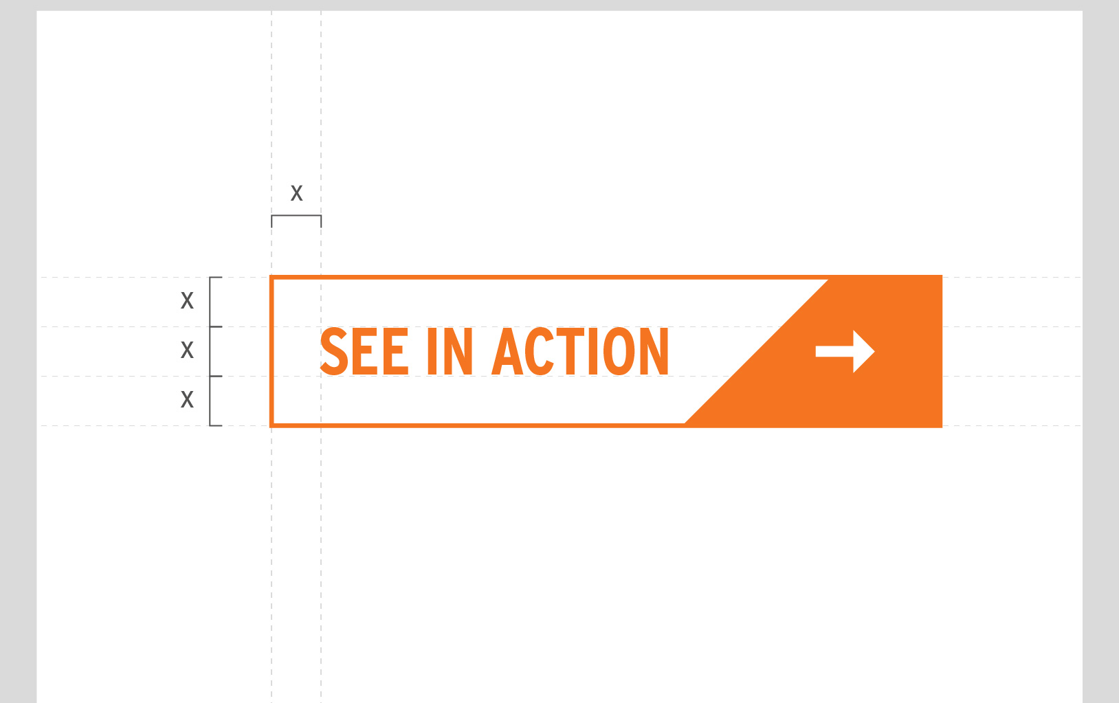
Buttons are used in digital contexts. They allow users to take an action.
Buttons are always stroked in orange.
They always terminate with a white arrow that is contained in an orange trapezoid.
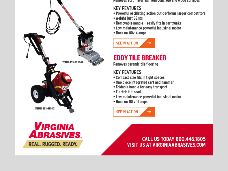
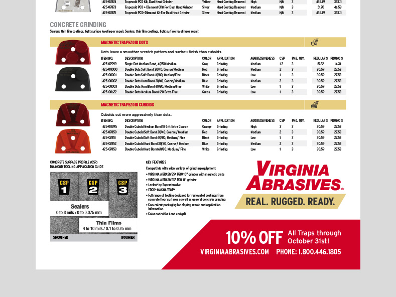
Here’s our visual style in action. In these applications you will be able to see how all of our assets work together to create a cohesive and well positioned brand. When creating new applications, compare them with these examples to ensure they fit in seamlessly.

Whether it is your first time reviewing this Brand Suitcase or the 132nd, it is always smart to revisit the rules and recommendations for the specific files you are downloading. Keep in mind, this platform will continually be updated as the brand progresses — so be sure to check back with each new project.

